WPA Junior Academy
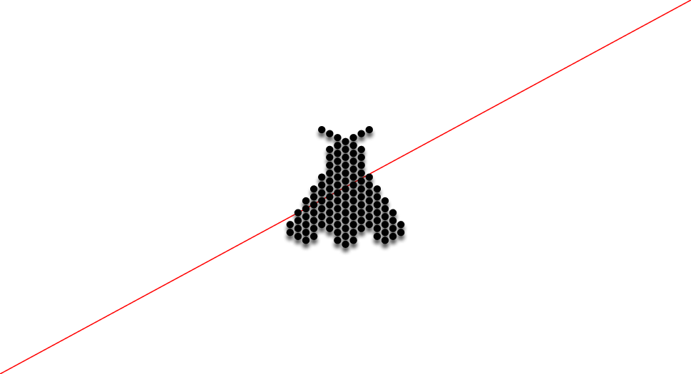
All pictograms for each level of the Academy are constructed on the same grid. This ensures consistency across the system while allowing each level to be distinguished by its unique graphic expression.
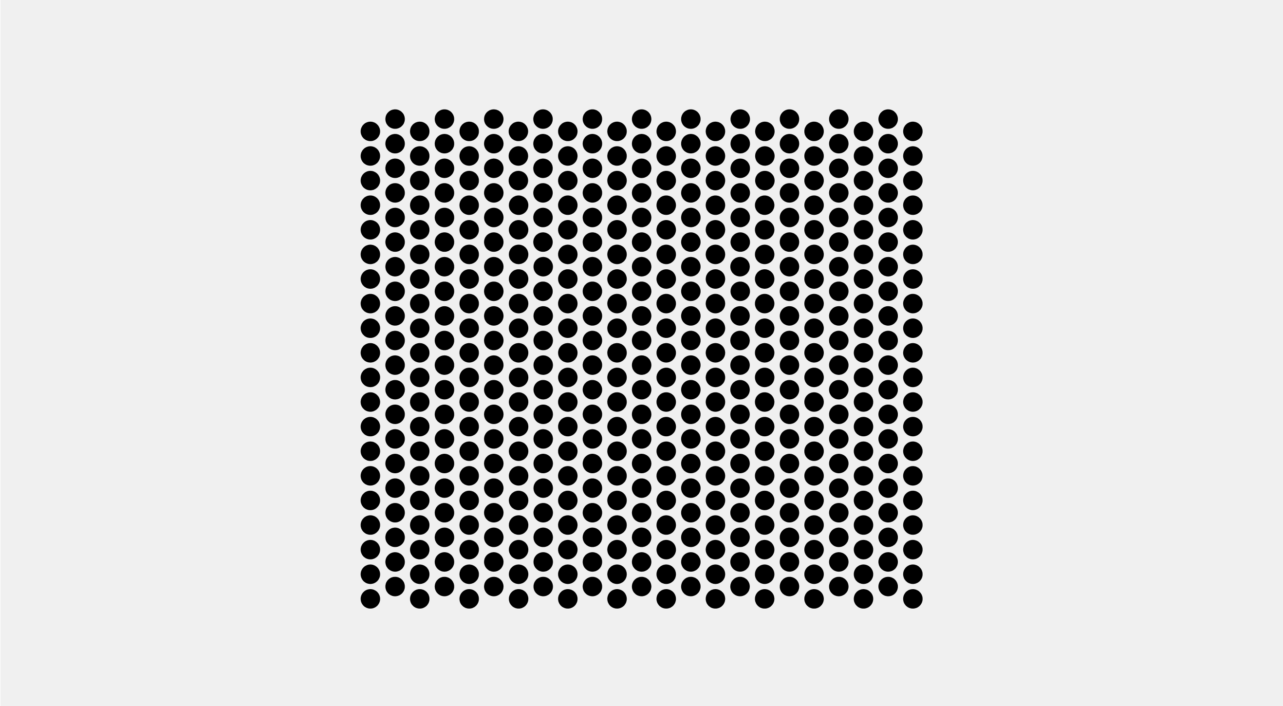
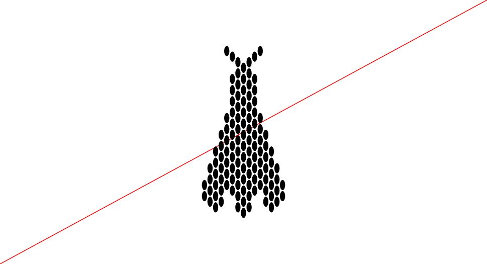
As described in the graphic device, the same grid used for signage is applied here. The only difference lies in a subtle vertical offset within the composition, which introduces a sense of movement and dynamism.
WPA Academy Logo and Icons
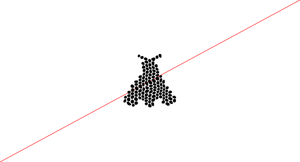
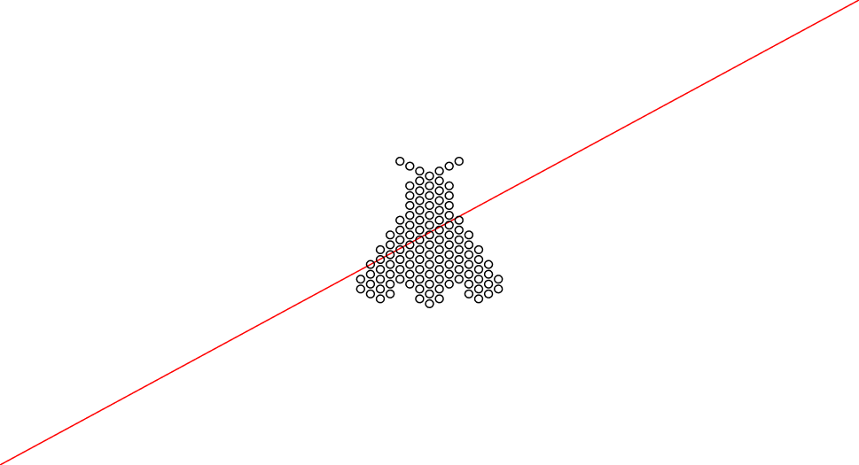
Grid
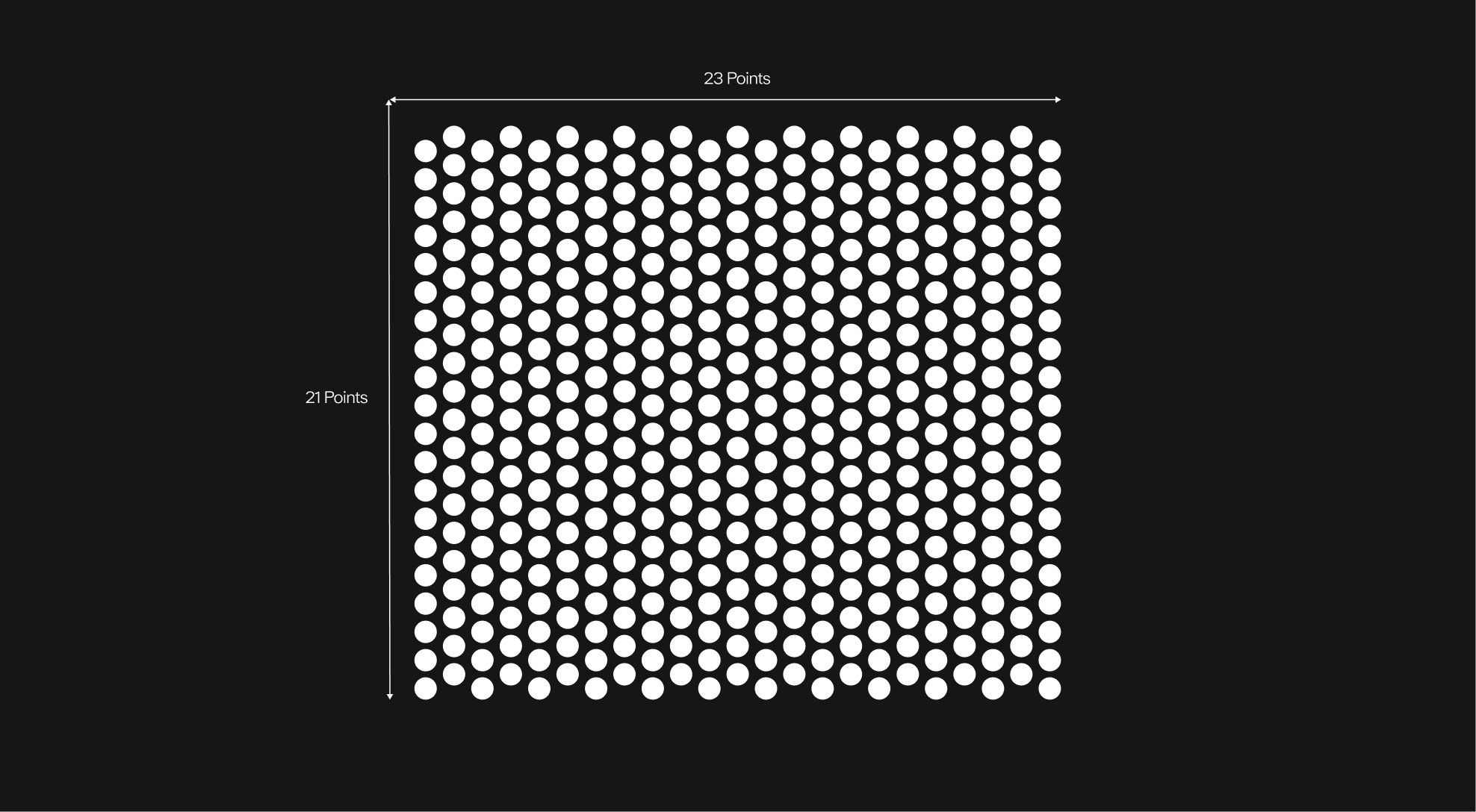
The grid is defined by a fixed number of points both vertically and horizontally. Its structure shifts subtly to create rhythm and balance within the composition. This approach ensures that layouts remain structured yet flexible, providing consistency across all brand applications.
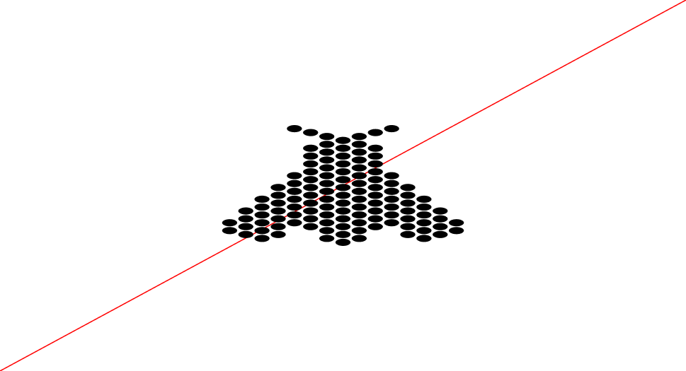
Construction
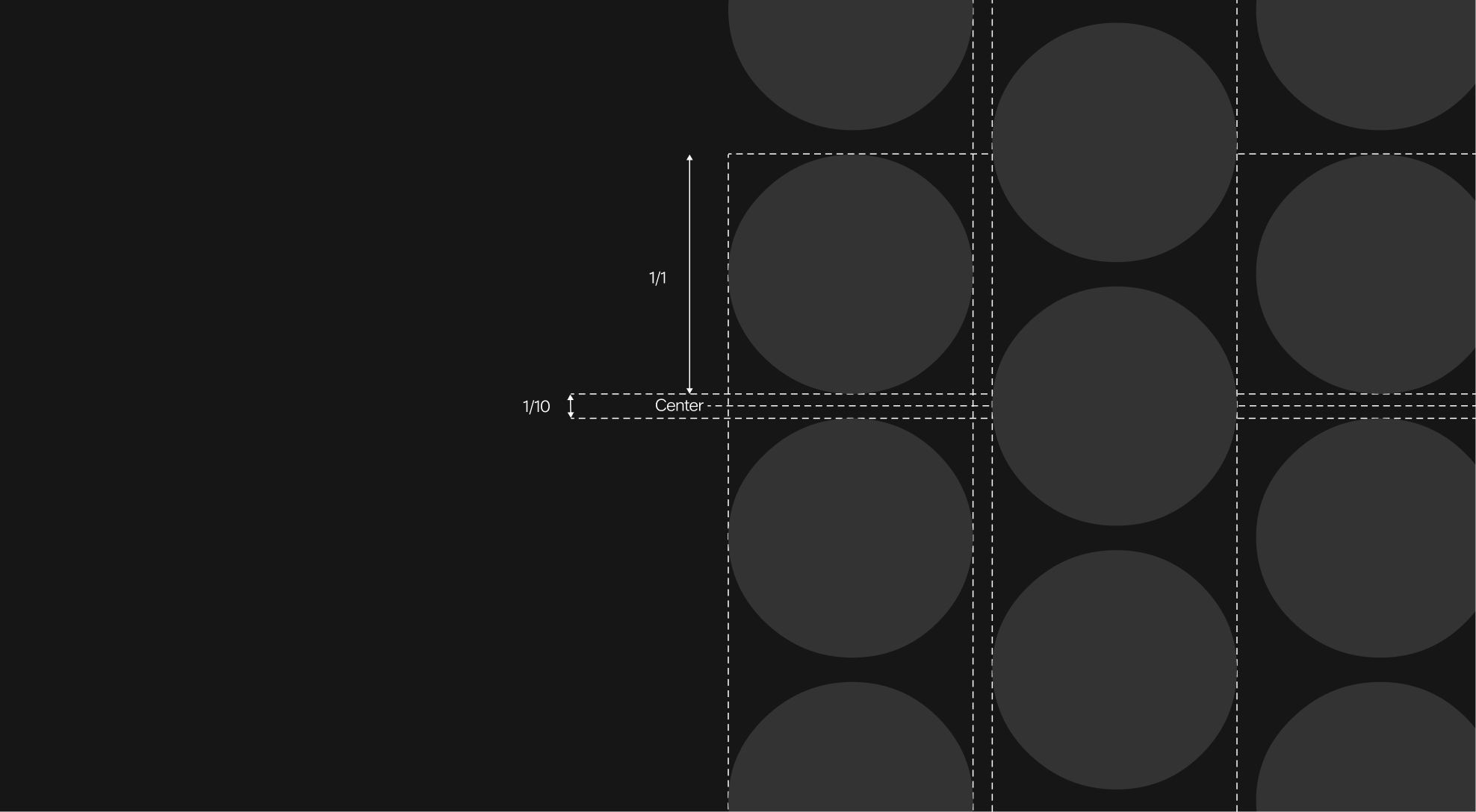
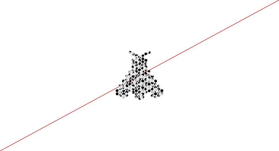
The grid is built on a modular 1:1 ratio.
Each unit follows a square structure, but with a deliberate 10% offset from the center. This shift introduces a more organic and dynamic quality, reflecting the Academy's spirit and the growth of its players.

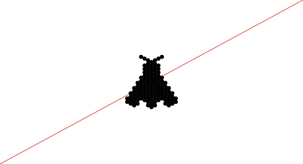
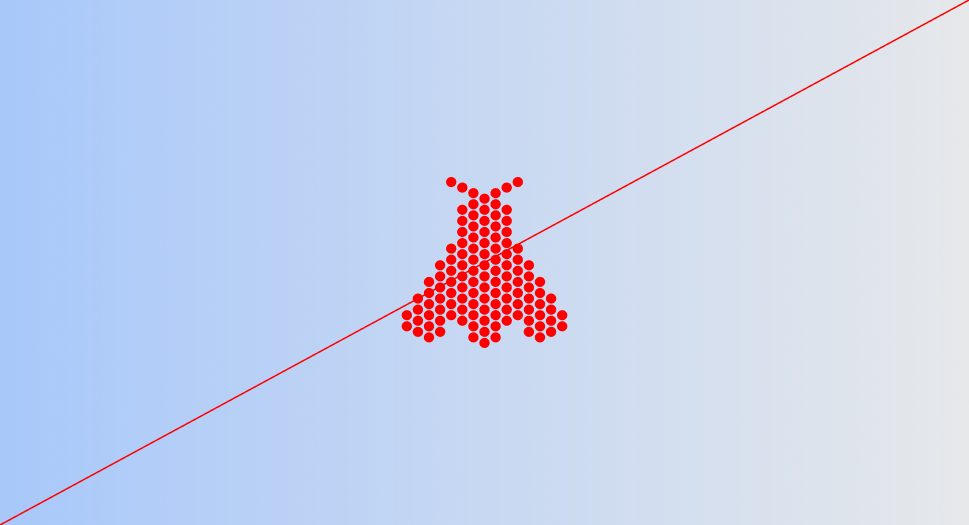
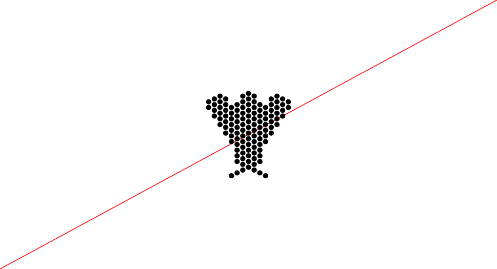
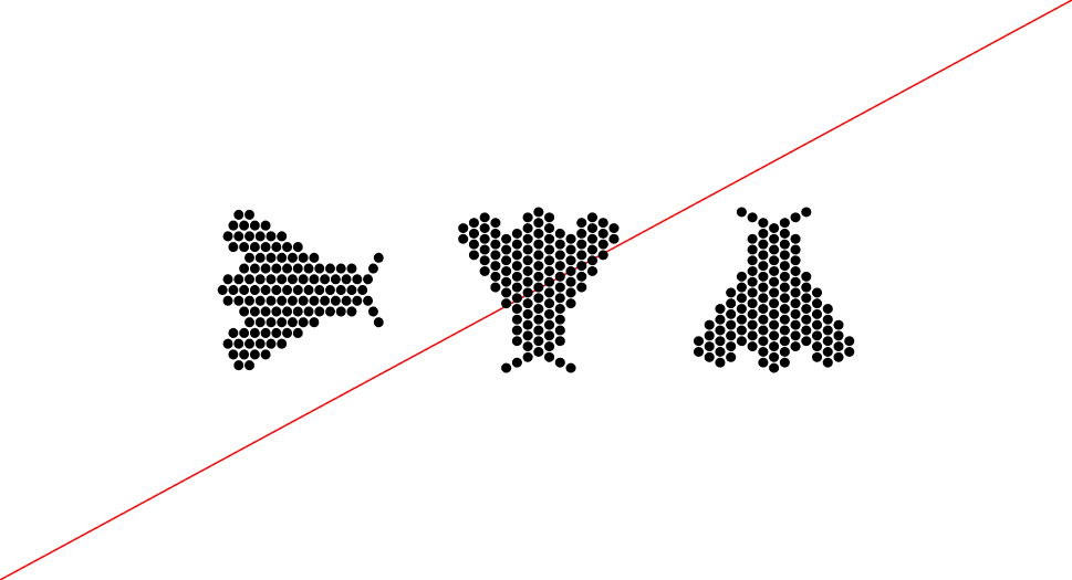
Family
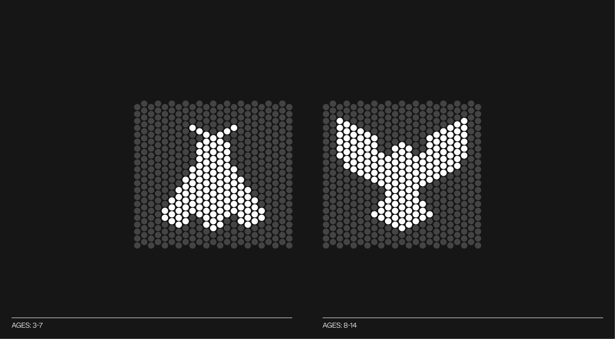
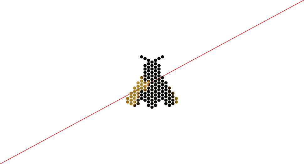
From Fly (Ages 3-7) to Falcon (Ages 8-14),
The icons evolve alongside the players, reflecting their journey through the Academy. At the earliest stage, the Fly symbolizes catching the “bug” of the sport. Discovering padel with curiosity and enthusiasm. As players grow, the Falcon represents the next step: developing the skills, strength, and confidence needed to master the game. Together, these icons embody progression, growth, and ambition within the Academy pathway.
Icon Misuse
The Academy icons are built on a precise grid system, and their design must remain consistent across all applications. They should never be altered, decorated, or manipulated in any way that could compromise their clarity or meaning.
 Do not apply a stroke to the icon
 Do not add shadows or 3D effects to the icon
 Do not compress the icon disproportionately
 Do not change the icon color outside of the approved palette
 Do not distort or redraw the icon shape
 Do not outline the icon
 Do not rotate the icon 180 degrees
 Do not stretch the icon disproportionately
 Do not apply photographic or textured fills to the icon
 Do not apply patterns or decorative effects to the icon
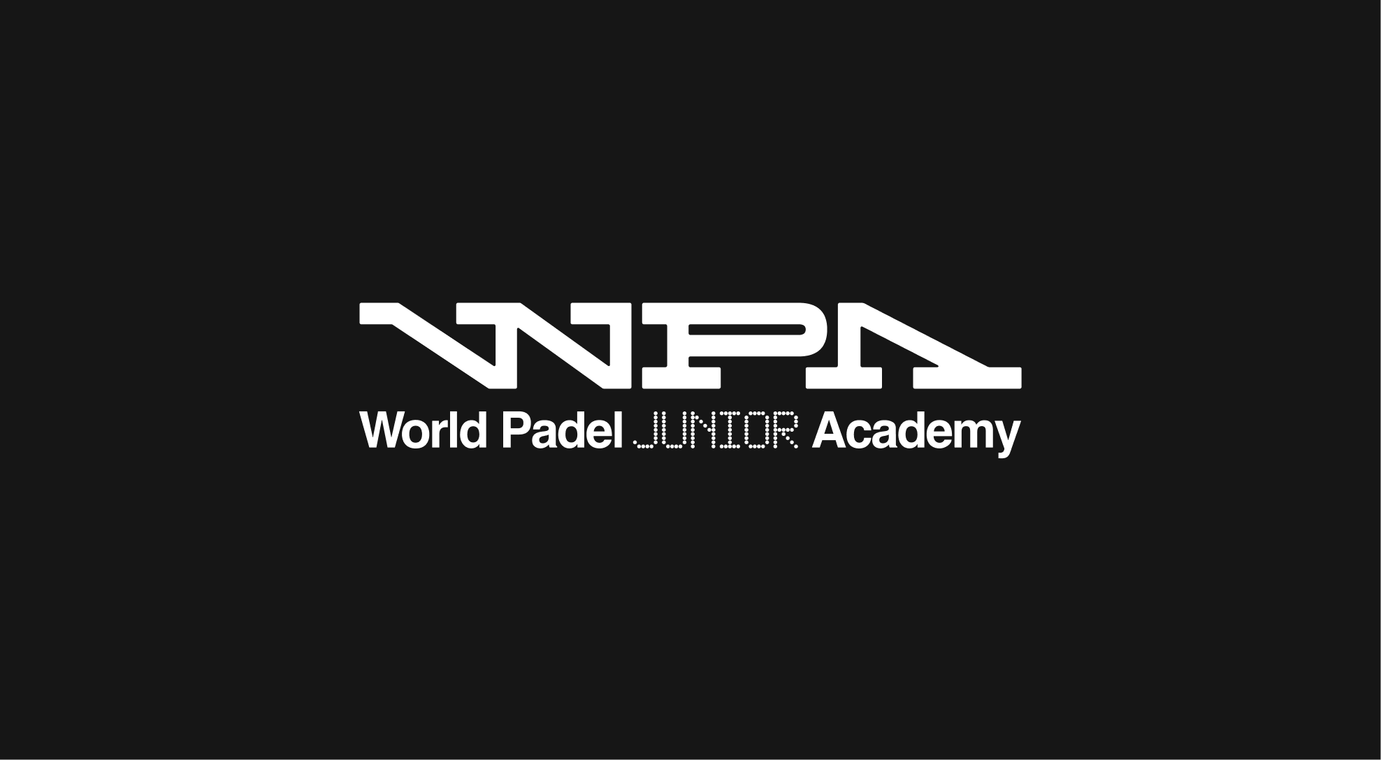
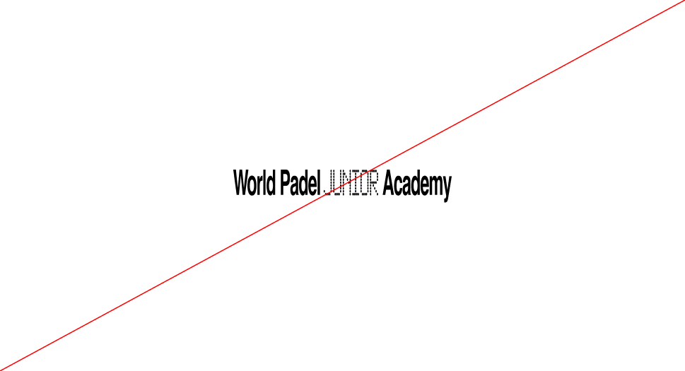
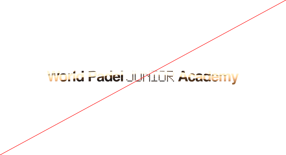
Wordmark
Overview
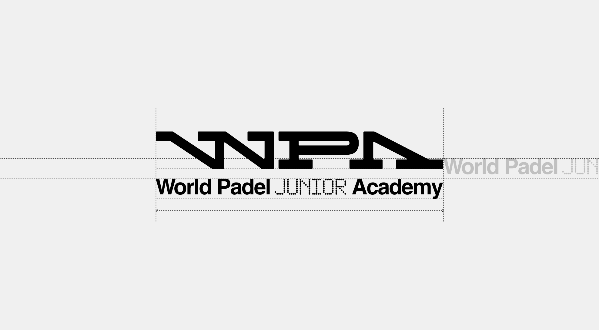
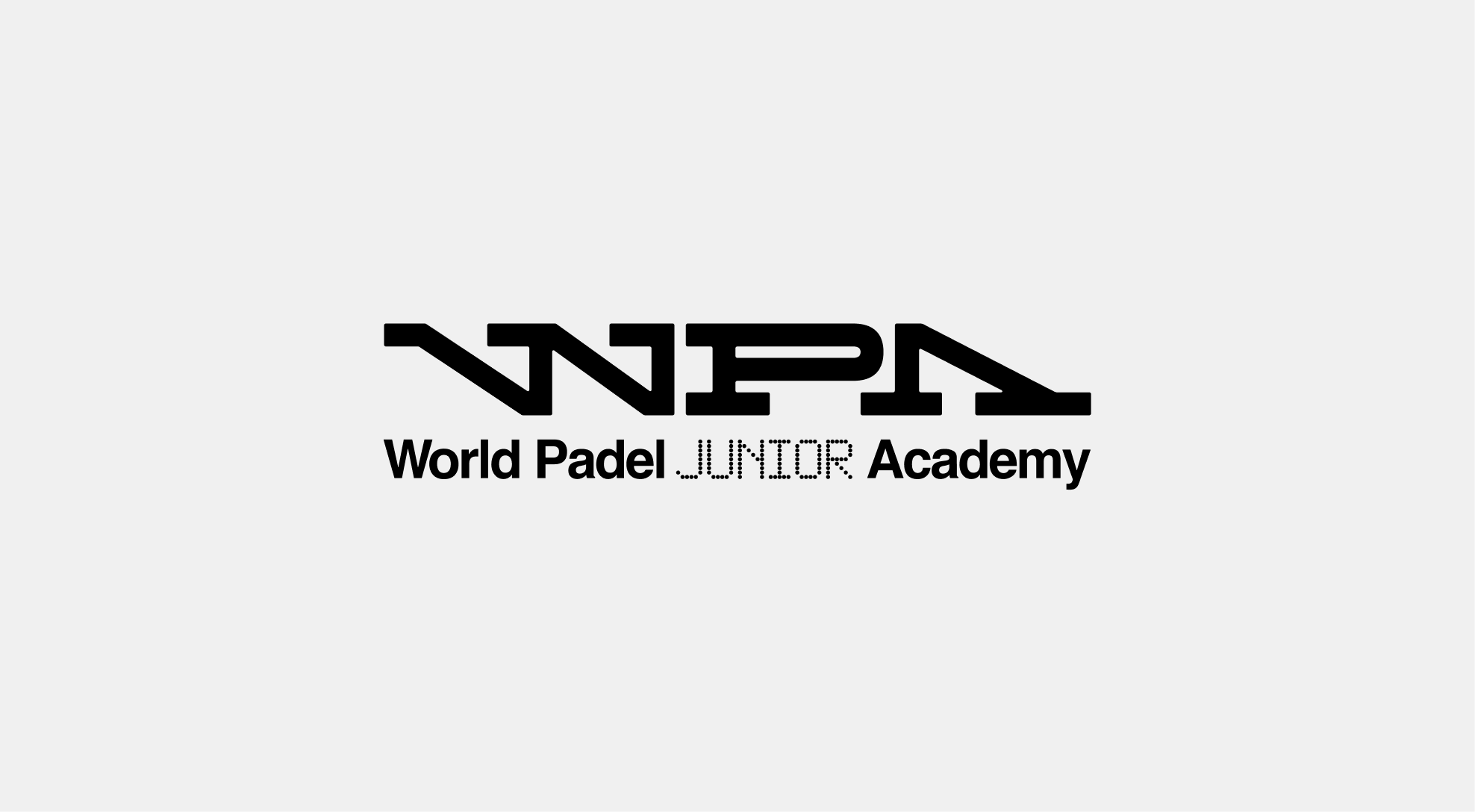
The Academy wordmark follows the same construction principles as the primary WPA wordmark. Using the dot system, it is precisely aligned to the mid-height of the capital letters to ensure balance and harmony. This approach creates a distinct sub-family within the Academy while maintaining strong recognition across the overall identity system.

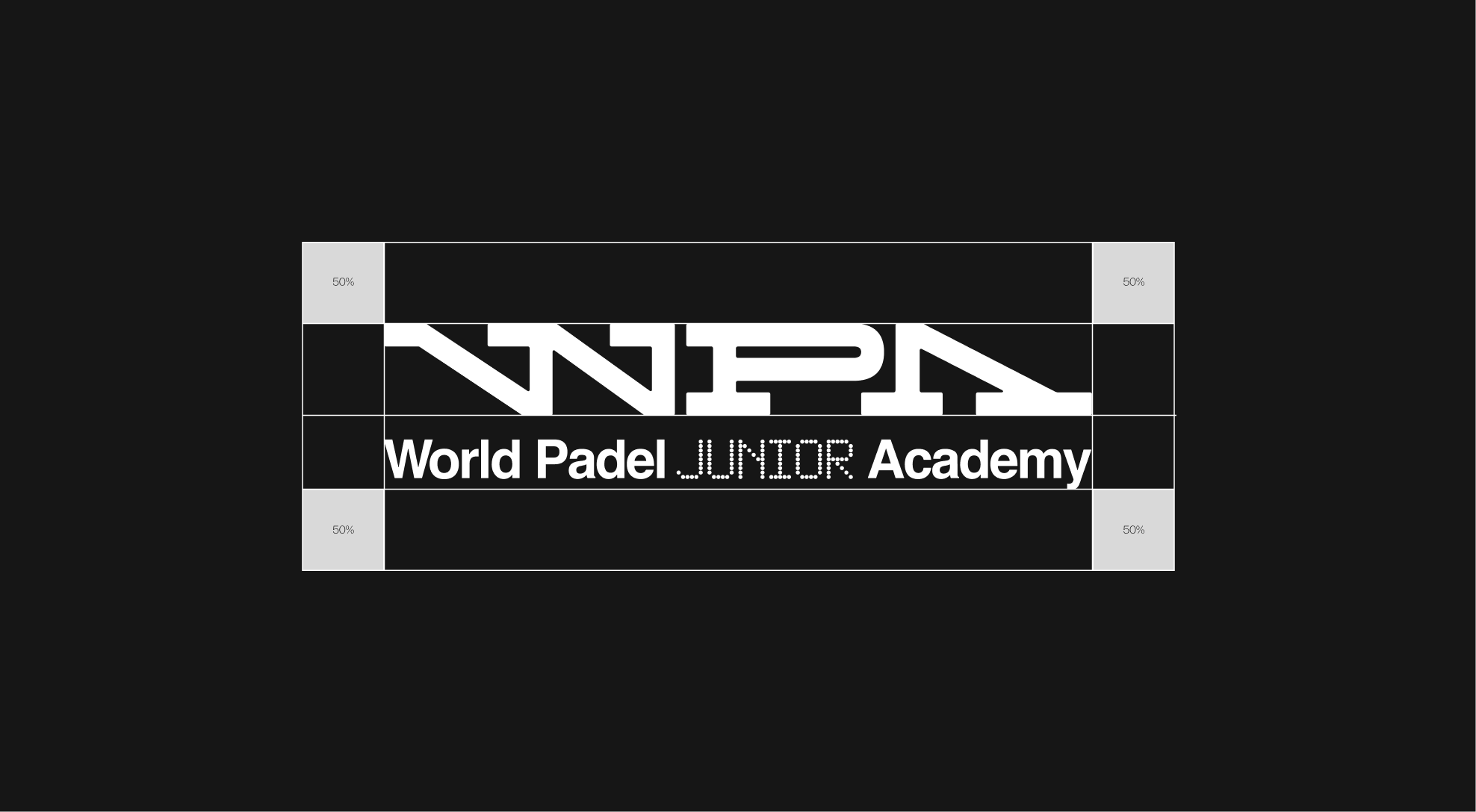
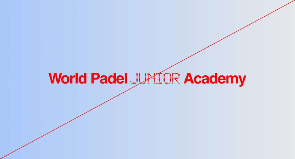
Clearspace
When using the World Padel Junior Academy wordmark, always maintain sufficient clear space to ensure visibility and impact. This protected area must remain free of text, imagery, or any other graphic elements. The minimum clear space is defined as 100% of the wordmark’s height and should scale proportionally across all applications. Exceptions apply only within approved lock-up configurations.


Wordmark - Alternative
Construction
In applications where the available format is reduced or more vertical, an alternative wordmark configuration is used. This construction places the WPA symbol above the World Padel Junior Academy wordmark, ensuring strong visibility and readability in tighter layouts. The vertical spacing is defined as 50% of the height of the wordmark, maintaining balance while keeping the WPA sign instantly recognizable. This configuration preserves brand consistency across all formats while adapting seamlessly to spatial constraints.
Clearspace
To maintain clarity and impact, the alternative wordmark must always be surrounded by clear space free of any text, imagery, or graphic elements. This protected area ensures the mark remains visible and legible across all applications. The minimum clear space is defined as 50% of the lock-up’s height and should scale proportionally across all formats.
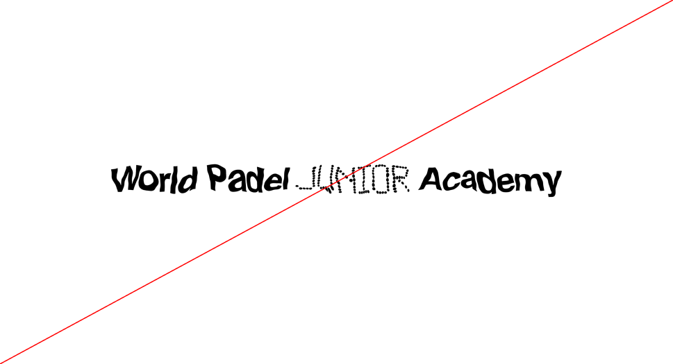
Wordmark - Alternative - Misuse
The World Padel Junior Academy wordmark must always remain consistent and uncompromised. It should never be altered, distorted, decorated, or combined with effects that reduce legibility. Below are examples of incorrect applications to avoid in every instance.
 Do not apply a stroke to the wordmak
 Do not add shadows or 3D effects to the wordmak
 Do not compress the wordmak disproportionately
 Do not change the wordmak color outside of the approved palette
 Do not use gradients in the wordmak
 Do not distort or redraw the wordmak shape
 Do not outline the wordmak
 Do not rotate or tilt the wordmak
 Do not stretch the wordmak disproportionately
 Do not flip or mirror the wordmak
 Do not apply photographic or textured fills to the wordmak
 Do not apply patterns or decorative effects to the wordmak
WPA Academy System
System
Type Construction
The dot typography bridges the Academy and the signage system, creating a unified but distinct visual language. Within the Academy, it introduces rhythm and playfulness, while in signage it ensures clarity and structure.
This dual role allows the dot system to separate functions while keeping the overall identity cohesive and instantly recognizable.

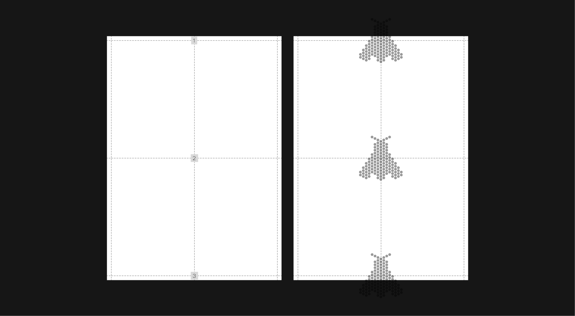
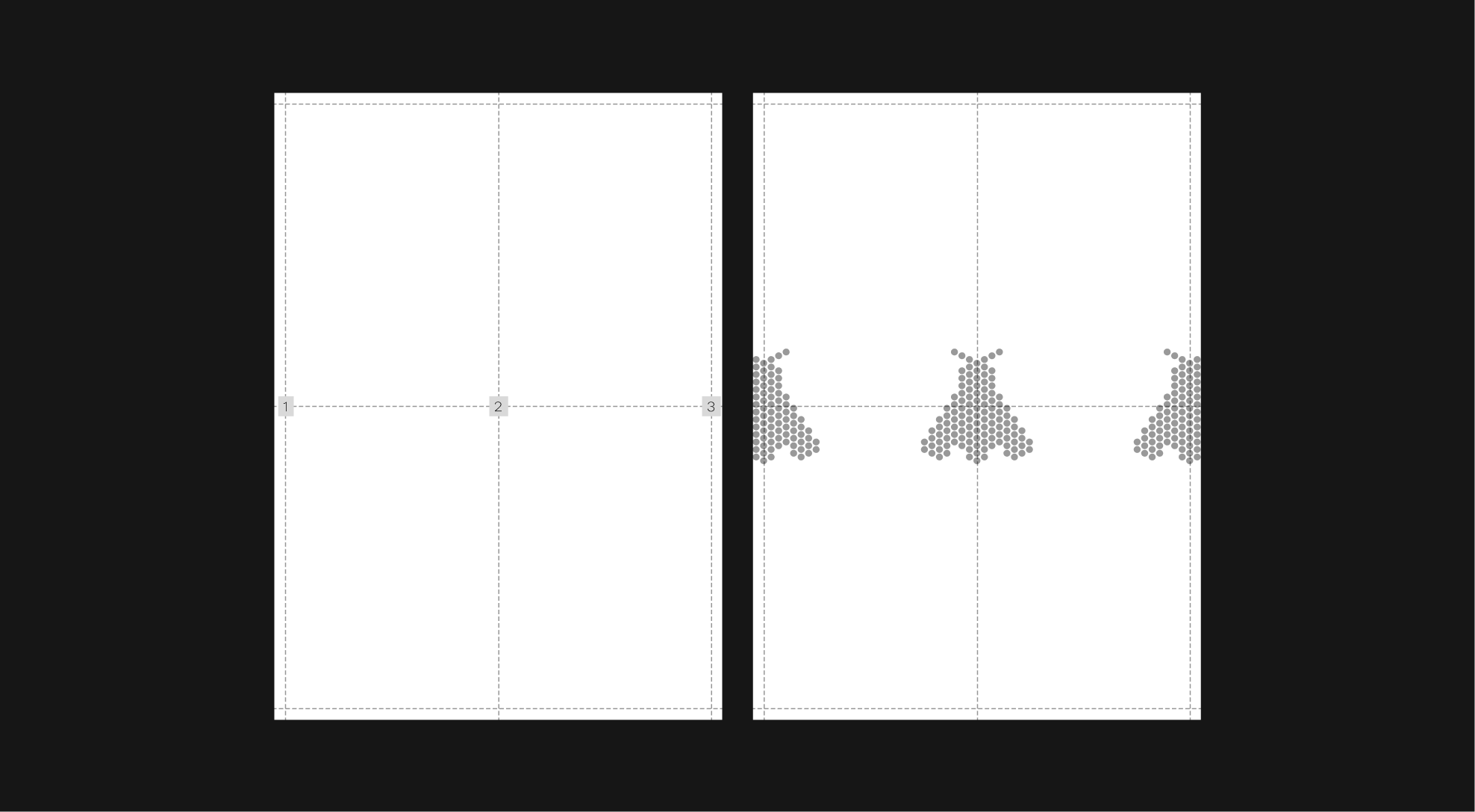
Icons
Placement
The vertical frieze is the most global and consistent way to apply the icons, placing them along the central axis at the top, center, and bottom with equal spacing. This approach ensures strong rhythm and recognition across all formats.
In certain cases, depending on the format, the system may also be applied horizontally while maintaining the same spacing principles.
 Main principle
 Second Possibility
Application Examples
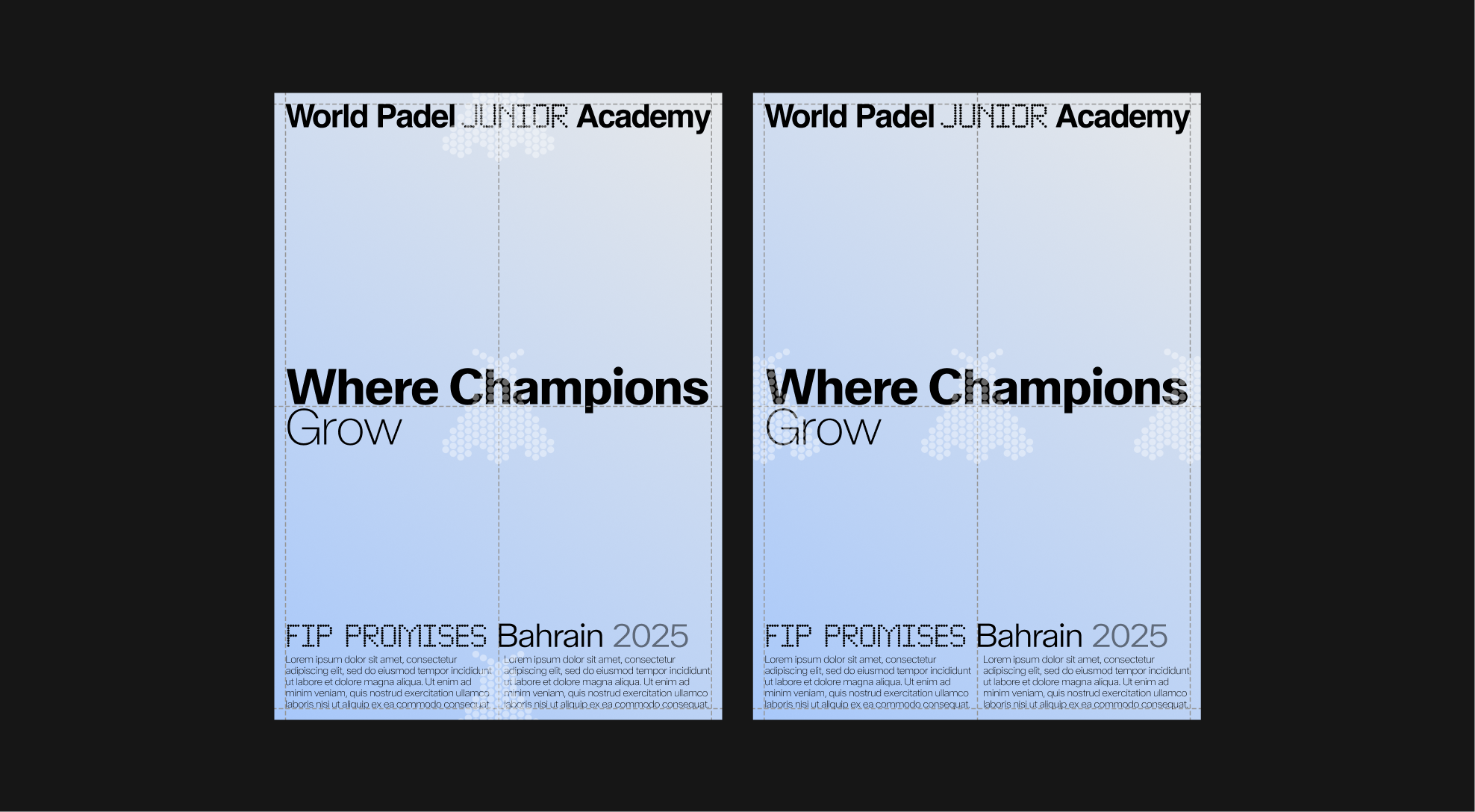
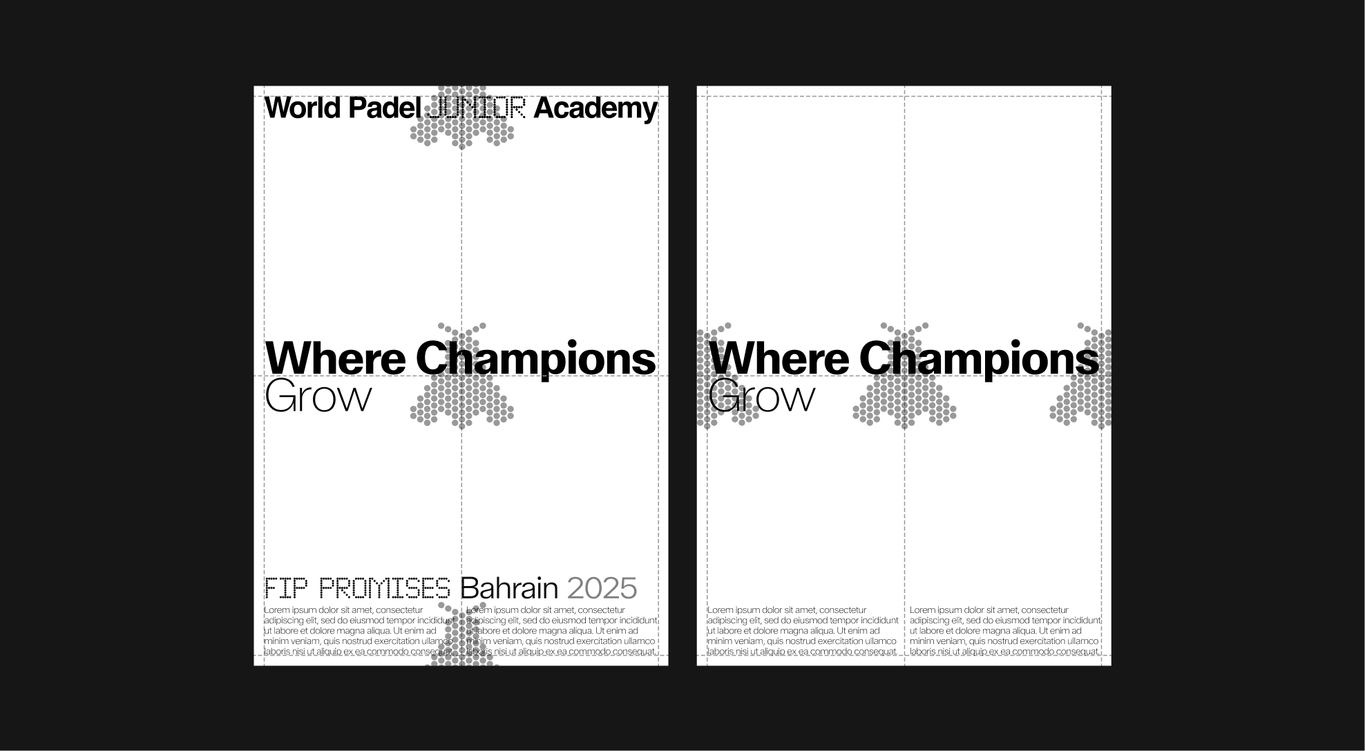
 Standard format — A4
 Standard format — 9/16
 Standard format — 4/5
 Standard format — 3/1
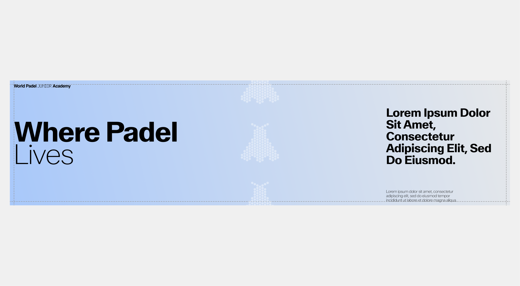 Standard format — 4/1
 Standard format — 3/2
Academy Icons
Misuse
The Academy icons are designed with a strict system to ensure clarity, consistency, and recognition across all applications. To preserve their integrity, icons must not be altered, distorted, or combined in ways that compromise their structure. Below are common misuses to avoid.
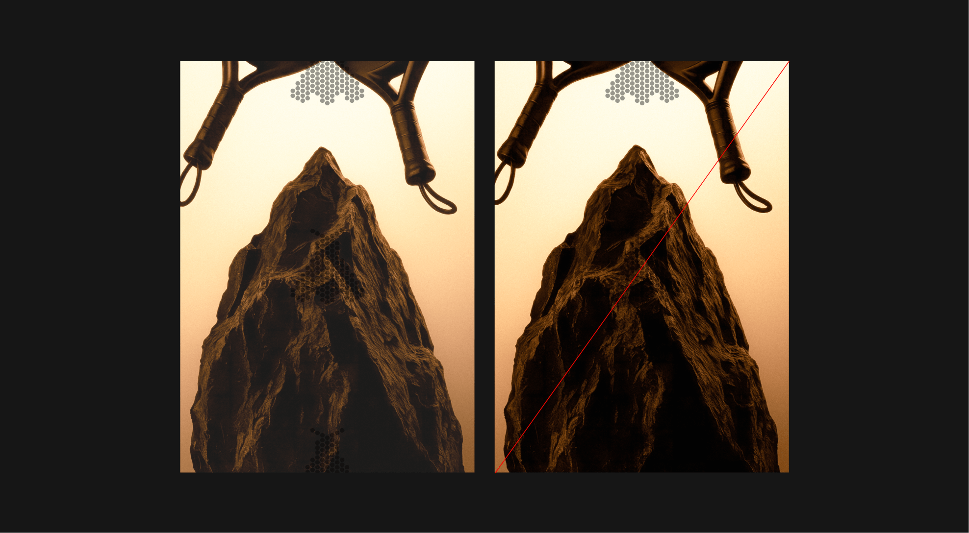
 Do not rotate icons within a single composition.
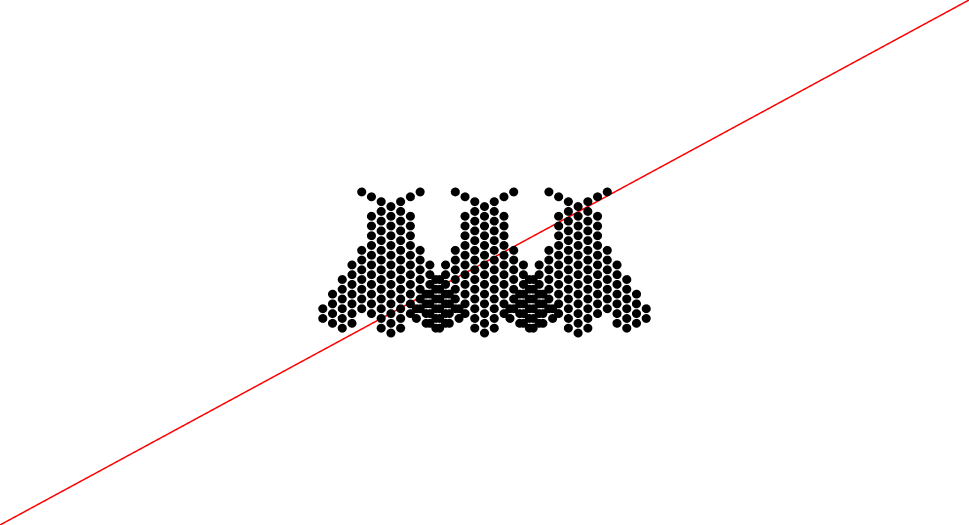
 Do not align icons diagonally within a single composition.
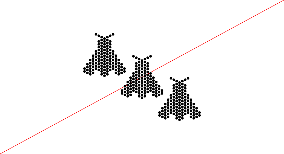
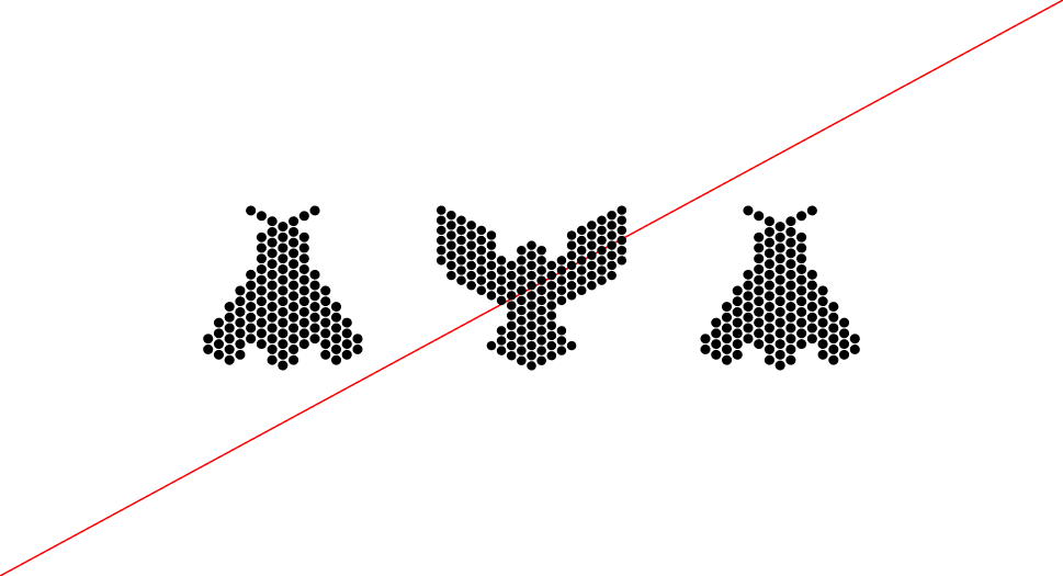
 Do not use more than three icons, or fewer than one icon, within a single composition.
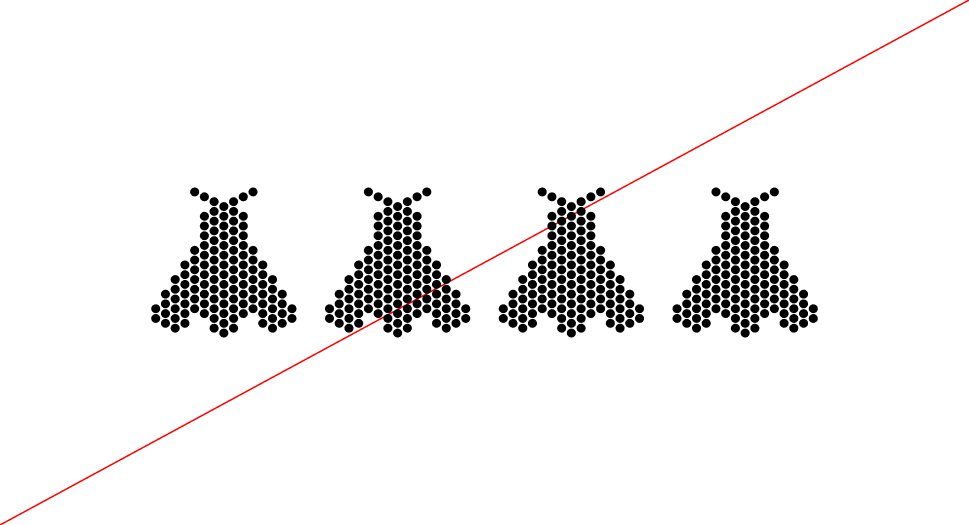
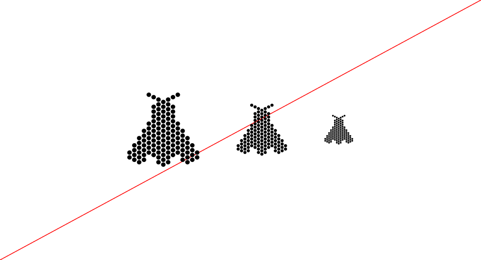 Do not resize icons inconsistently or mix scales in one composition.
 Do not overlap icons within a single composition.
 Do not mix different icon families within a single composition.
WPA Academy Colors
Setup
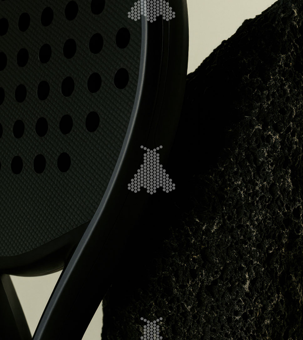
WPA Academy icons must always be placed in the foreground, above all other layers in the composition. They should never be used at 100% opacity: always apply them in white, set to 40% opacity, to maintain lightness and elegance. The only exception is when the background or imagery is too light, in which case the color may be adjusted to ensure visibility while staying true to the system.

Specific Rules
In most cases, Academy icons should be applied in white at 40% opacity to ensure consistency and readability. However, when the background is too bright and visibility is compromised, icons may be applied in black at 40%. This alternative should only be used when strictly necessary.
 Icon applied in black at 40% opacity to remain visible on a light background. Use this option only when white loses legibility.
 Icon applied in black at 40% opacity to remain visible on a light background. Use this option only when white loses legibility.
Specific Rules
When working with images that contain multiple levels of contrast, always base the application of icons on the dominant brightness of the composition. If the overall background is too dark and risks reducing visibility, apply a subtle white layer at 10% opacity on top. This adjustment ensures that the image remains lighter, creating enough clarity for icons and text.
Misuse
The Academy icons must remain simple and consistent to preserve their clarity and recognition. Do not alter their colors, add gradients, or apply solid fills. Icons should always be used in white at 40% opacity on both light and dark backgrounds, ensuring maximum visibility and alignment with the brand system.
 Do use black icon for lighter backgrounds
 Do not apply a gradient to icon
 Do use white icon for darker backgrounds
 Do not apply a solid color to icon
WPA Academy Scale - Alignment and Position
Position
The icons must always be placed in the center of the composition to ensure balance and consistency across all formats. This central placement reinforces the identity system and creates a strong, recognizable visual language.

Scale - Horizontal Format
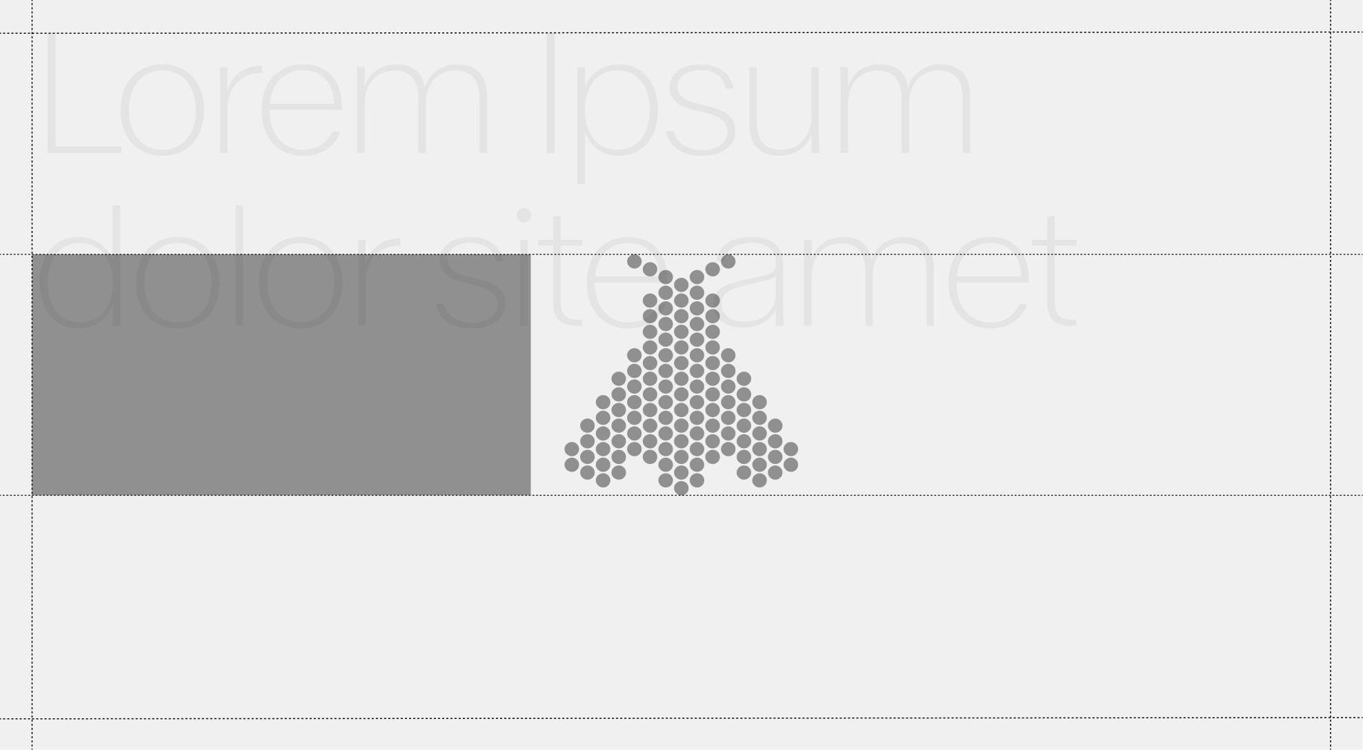
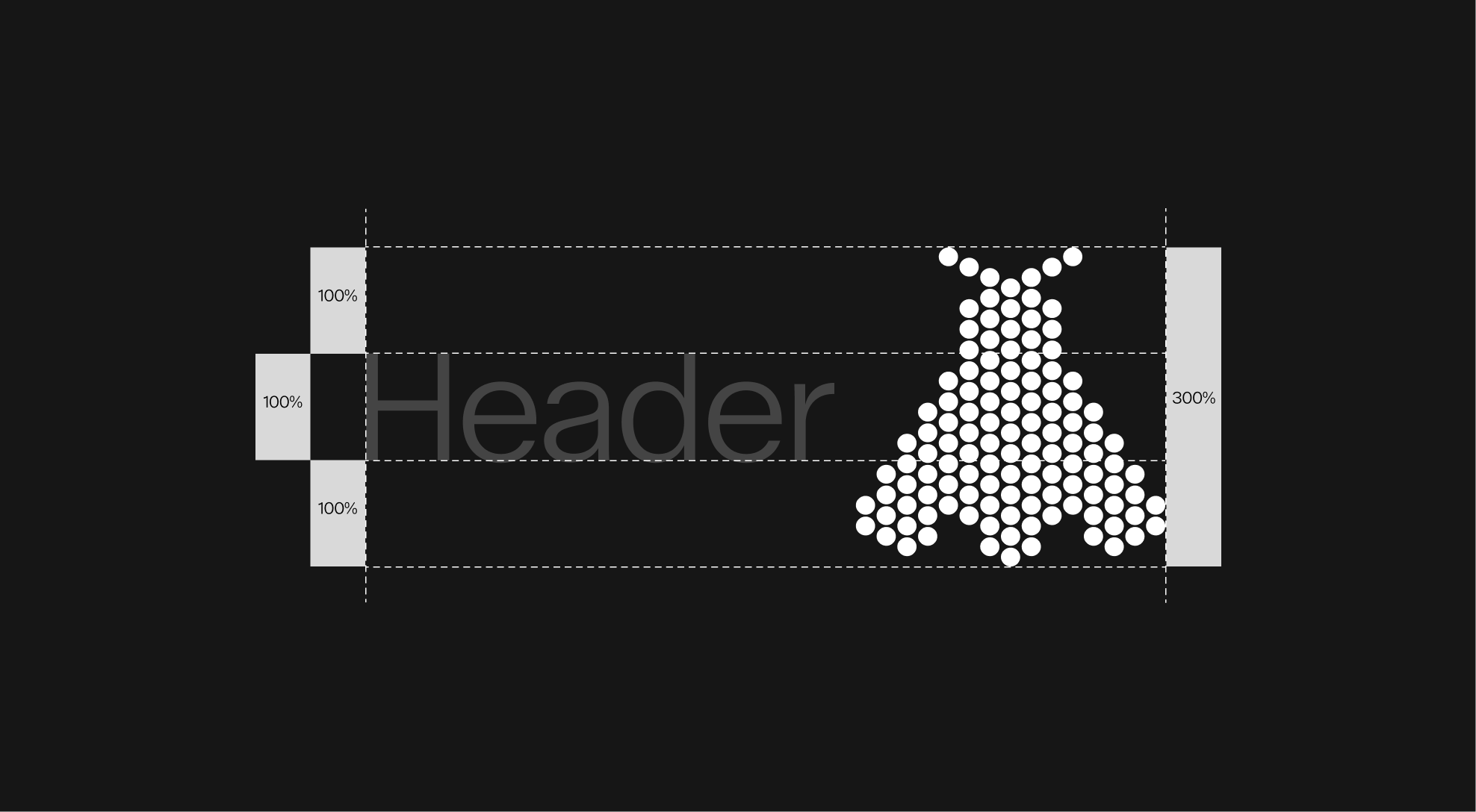
The size of the icons is always determined in relation to the header, based on the height of the capital letters in the largest type used within a format. This ensures a coherent and proportional relationship between text and icon across all applications.
In elongated horizontal formats, icons may be scaled up to 2x the capital height to maintain visibility and balance.


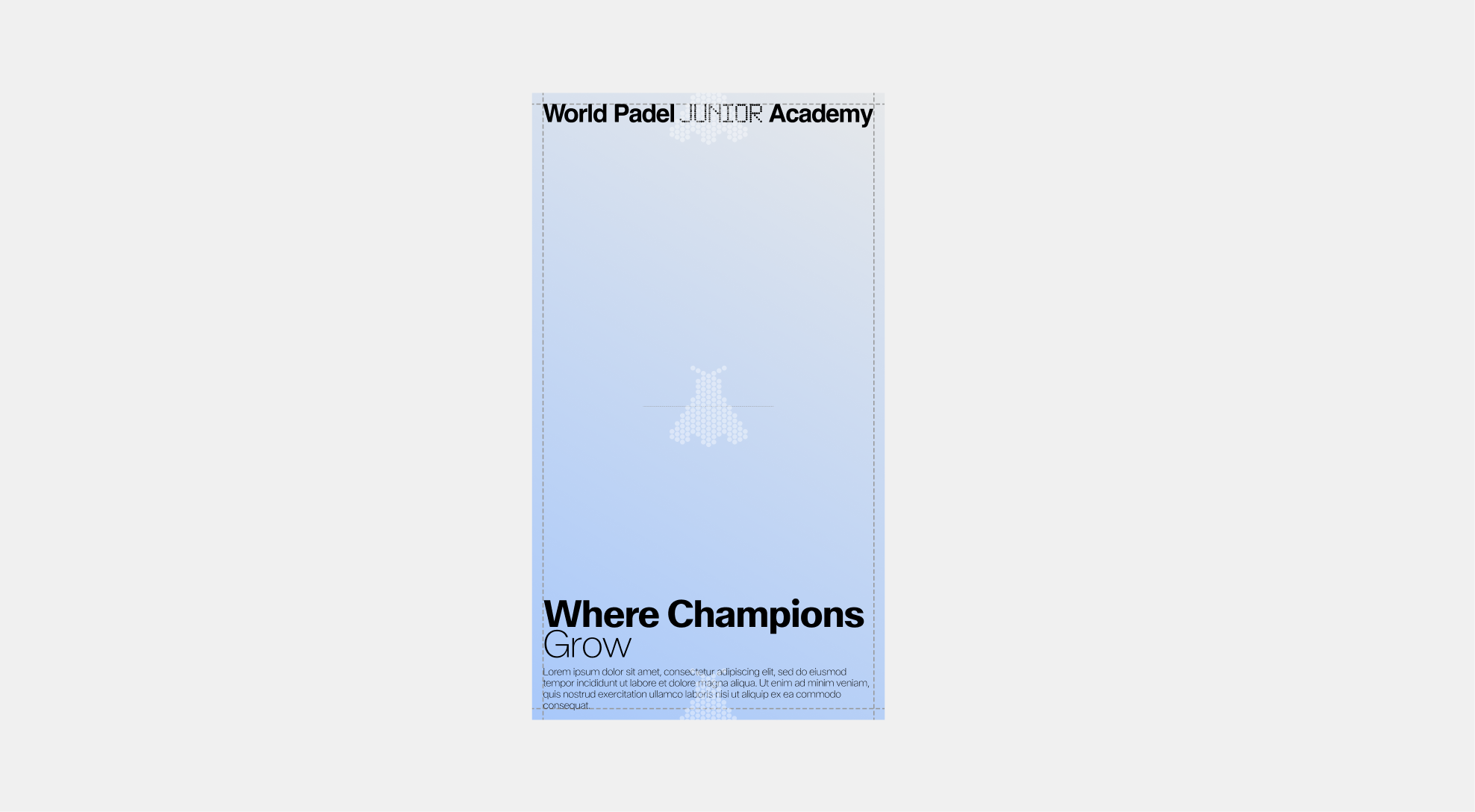
Scale - Vertical Format
The size of the icons is always determined in relation to the header, based on the height of the capital letters in the largest type used within a format. This ensures a coherent and proportional relationship between text and icon across all applications.
In vertical formats, icons should be scaled up to 3x the capital height to ensure presence and impact.

Scale - Misuse
The icons have been designed with precise proportions to ensure clarity and balance within the system. Any alteration to their scale can disrupt legibility and weaken the visual identity. Always respect the established size rules and avoid the following misuses.


WPA Application Examples