Color
Color is one of the strongest tools in expressing the WPA identity. Our palette reflects both the premium nature of our brand and the vibrant spirit of padel. From core tones that ensure clarity and professionalism, to gradients that capture the dynamism and energy of the game, each shade has been chosen to support consistency across every touchpoint.
These guidelines define how color should be applied to logos, typography, and layouts to create a cohesive visual system. Used correctly, our palette reinforces WPA’s role as a modern, global leader in padel while remaining adaptable to different contexts and cultures.
Core Palette
Gradients are an expressive extension of the WPA palette. They add depth, energy, and movement to our communications, echoing the pace and vibrancy of padel itself. While gradients can be mirrored or angled, they should always stay within the approved tones and avoid high-contrast distortions. This ensures they remain sophisticated, consistent, and unmistakably WPA.
- Hex #FFFFFF
- RGB 255,255,255
- CMJN 0,0,0,0
- Hex #FFFFFF
- RGB 255,255,255
- CMJN 0,0,0,0
- Hex #FFD89E
- RGB 255, 216, 158
- CMJN 0, 15, 38, 0
- Hex #CFE2FF
- RGB 207, 226, 255
- CMJN 19, 11, 0, 0
Gradients
- Hex #CCCED4
- RGB 204, 206, 212
- CMJN 4, 3, 0, 17
- Hex #FFD9AA
- RGB 255, 217, 170
- CMJN 0, 15, 33, 0
- Hex #FFF1E0
- RGB 255, 241, 224
- CMJN 0, 5, 12, 0
- Hex #BDC8E8
- RGB 189, 200, 232
- CMJN 19, 14, 0, 9
- Hex #63646F
- RGB 99, 100, 111
- CMJN 11, 10, 0, 56
- Hex #FFE6C3
- RGB 255, 230, 195
- CMJN 0, 10, 24, 0
- Hex #595754
- RGB 89, 87, 84
- CMJN 0, 2, 6, 65
- Hex #FFE6C3
- RGB 255, 230, 195
- CMJN 0, 10, 24, 0
- Hex #F1DDC5
- RGB 241, 221, 197
- CMJN 0, 8, 18, 5
- Hex #FFC876
- RGB 255, 200, 118
- CMJN 0, 22, 54, 0
- Hex #E6E8EA
- RGB 230, 232, 234
- CMJN 2, 1, 0, 8
- Hex #A8C8FA
- RGB 168, 200, 250
- CMJN 33, 20, 0, 2
Options
 It is possible to mirror the gradient
 Do not distort the gradient creating higher contrast
 It is possible to angle the gradient (90°/45°)
 Do not change gradient tints
Logo
Color application on the WPA logo must always prioritize clarity and legibility. Black is used on light backgrounds, while white is used on dark backgrounds. When placed on imagery, contrast must be carefully maintained so the logo is never compromised. Following these rules ensures that the WPA mark remains a bold and confident symbol of the brand in every setting.
Typography
Our typography works hand in hand with our color palette to deliver clear, impactful messages. Text should always be applied in black or white, depending on the background, to maximize legibility. Gradients and decorative fills are not permitted. By keeping type applications simple and consistent, we reinforce WPA’s premium character and allow our words to speak with strength and precision.
 Do use black typography for lighter backgrounds
 Do not apply a gradient to typography
 Do use white typography for darker backgrounds
 Do not apply a solid color to typography
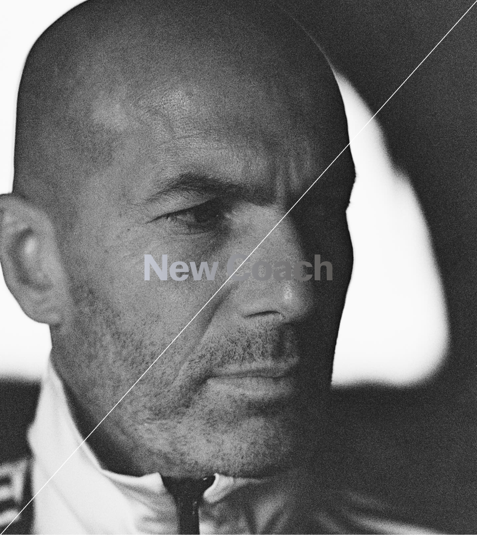
 Do use white typography on dark images
 Do not apply a gradient to typography
Combination
When color and imagery come together, balance is key. Use black or white backgrounds and typography to maintain contrast and clarity across layouts. Avoid layering gradients and images within the same composition, as this creates visual noise and weakens impact. The goal is always to keep messages clean, confident, and easy to read.
Misuse
Do not combine gradients and images on a single layout
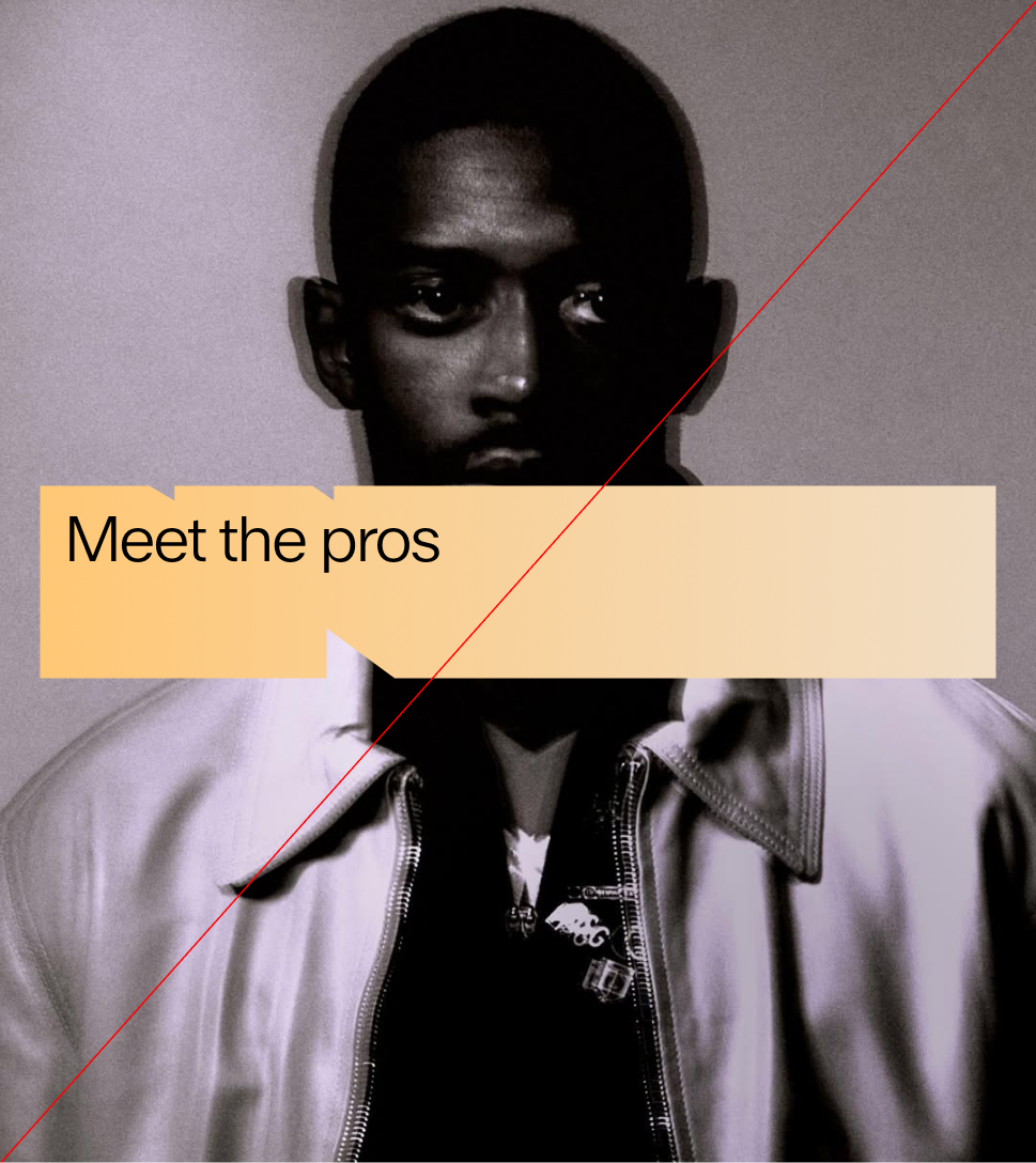
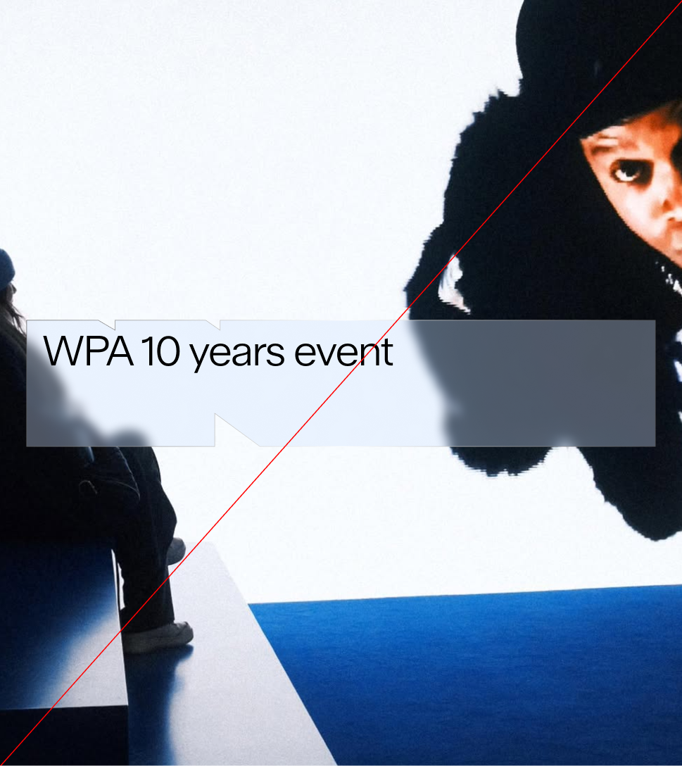
On Images
When applying typography or logos over photography, clarity must come first. Use containers in black or white, or apply transparent containers with careful contrast, to ensure the brand elements remain visible and consistent. Never add strokes, colors, or decorative effects to containers. By respecting these rules, WPA messaging stays professional, legible, and true to the brand's premium identity.
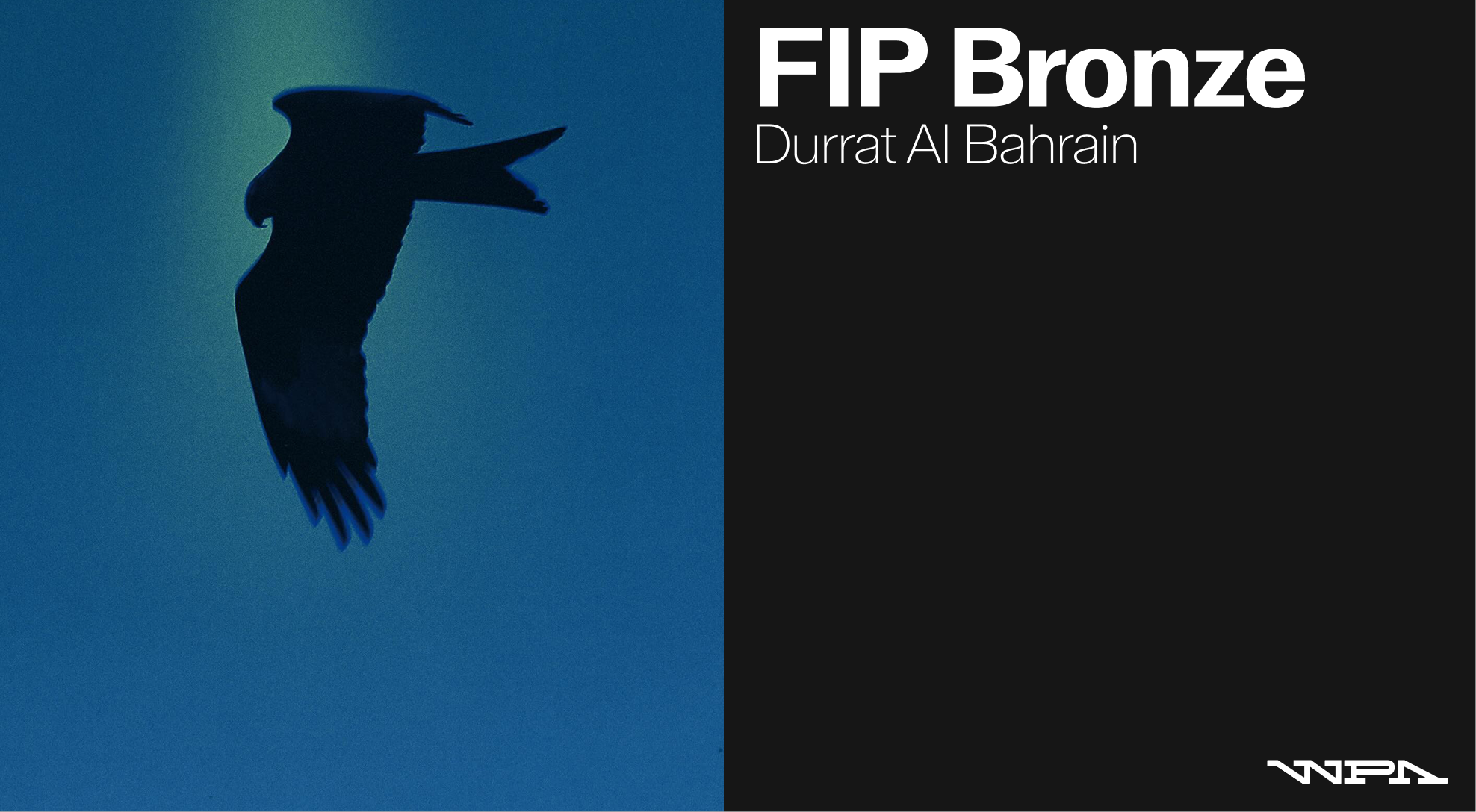
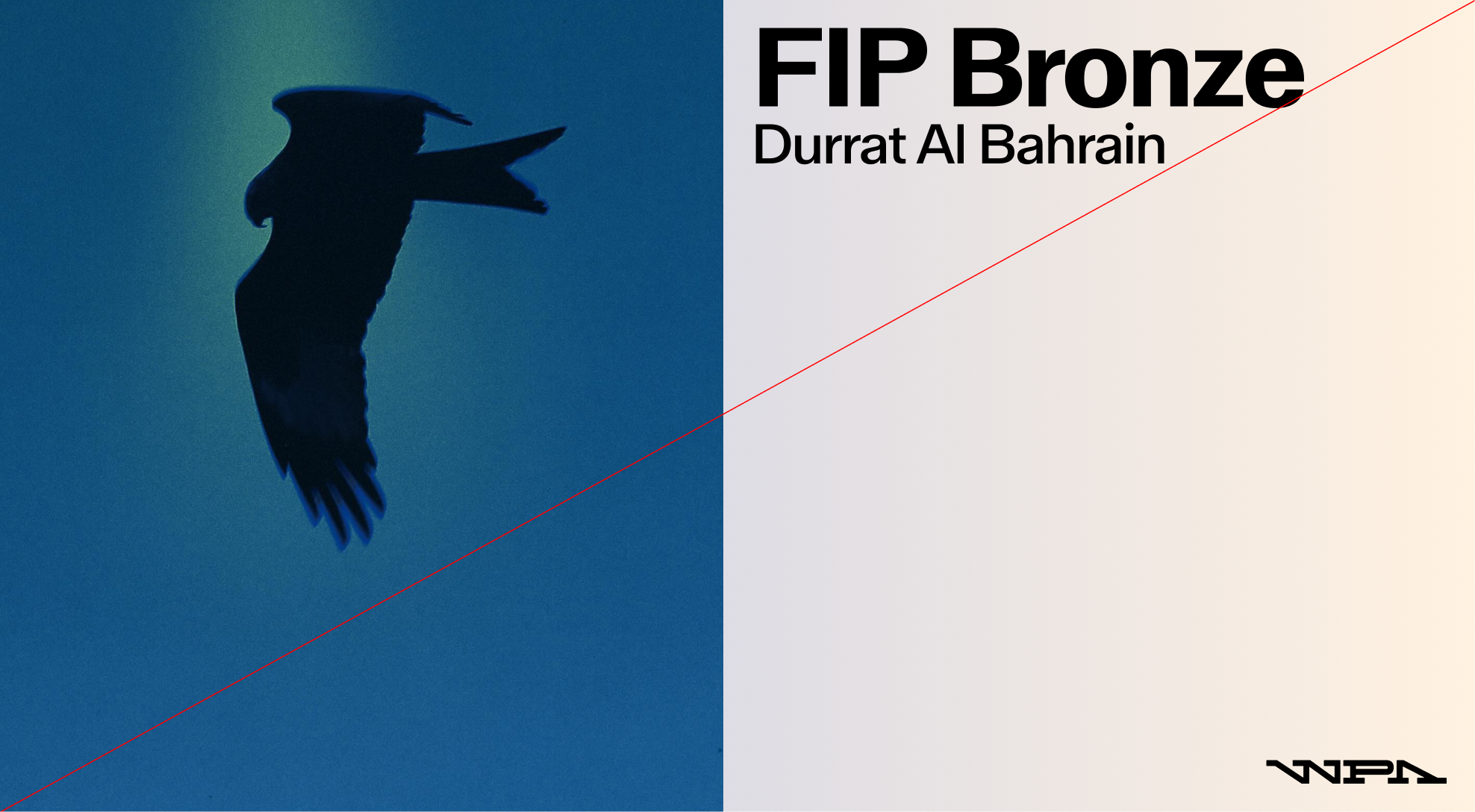
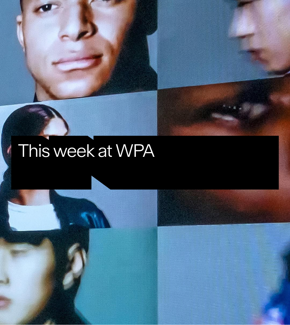 The logo container should be used in black with white typography on light images
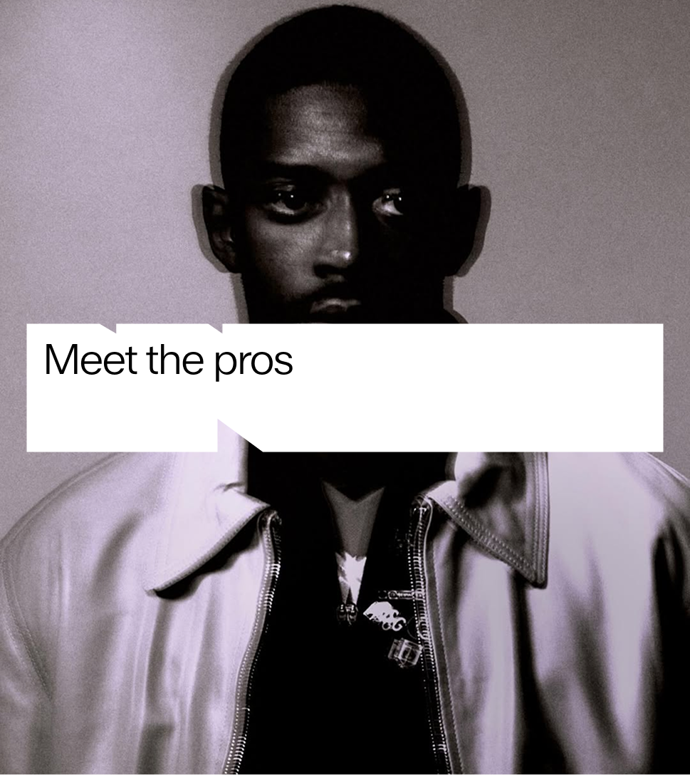
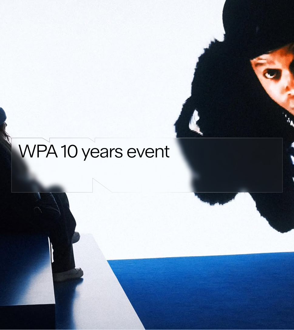
 The logo container can be used in transparent with white typography on dark images
 The logo container should be used in white with black typography on dark images
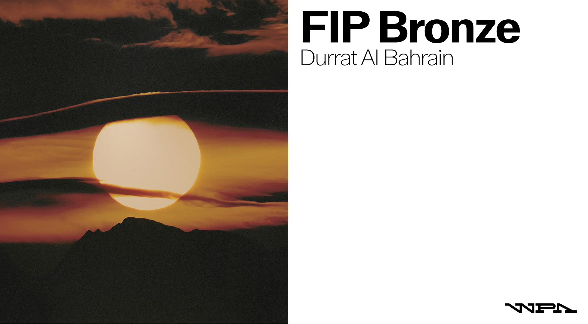
 The logo container can be used in transparent with black typography on light images
Misuse
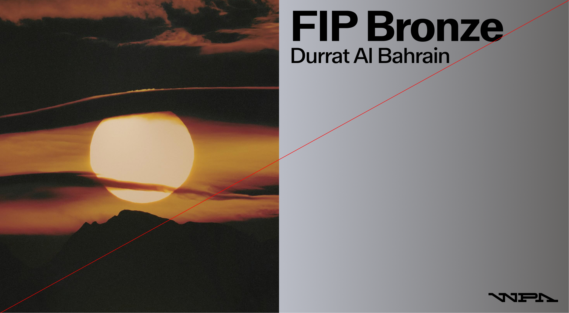
 Do not apply a color or stroke to the logo container
 Do not apply a color to the transparent logo container