Grid System
The grid system is the foundation of WPA's visual identity. Just like padel itself, it combines structure with fluidity — providing a clear framework that allows creativity and movement within defined boundaries. By using a consistent grid, we create layouts that feel balanced, professional, and instantly recognizable across every format.
These guidelines outline how the base grid, margins, and columns scale across different applications, from digital to print. They ensure that typography, imagery, and logos always work together in harmony, giving WPA communications a sense of rhythm and precision while keeping the brand adaptable and dynamic.
6.1. Overview
Principles of Consistency Across Formats

6.2. Base Grid
Base Grid Set Up
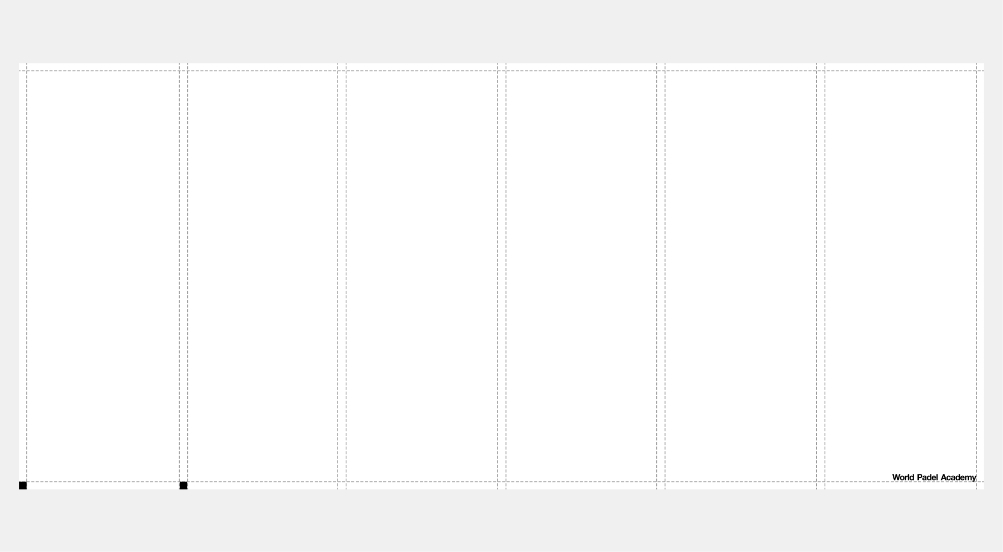
To understand how to structure our layouts, we first need to set up our grid. We call this our “base grid” and it starts from a simple unit: the 10px square. This minimum increment acts as the foundation for all our visual assets. From logos and typography to images, lines, and graphic devices.
 Grid Setup
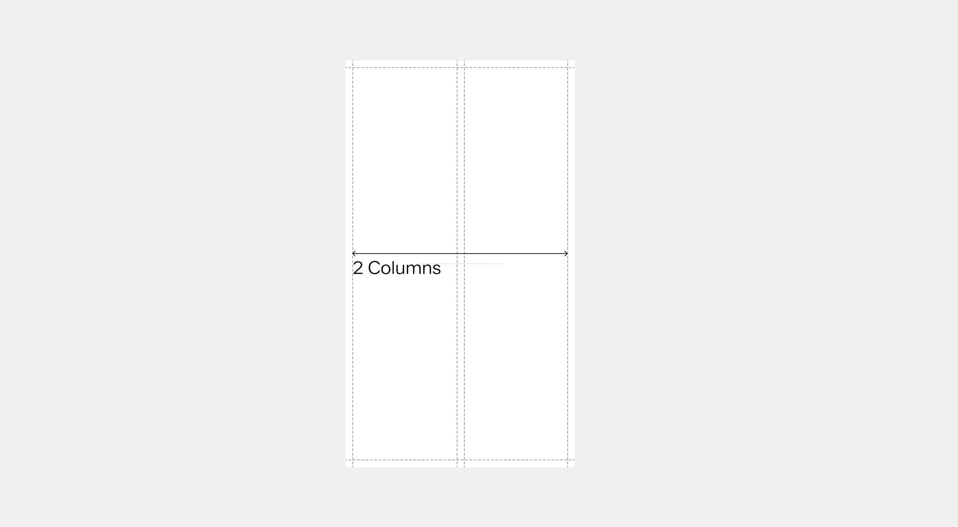
 Two-Column
 Four-Column
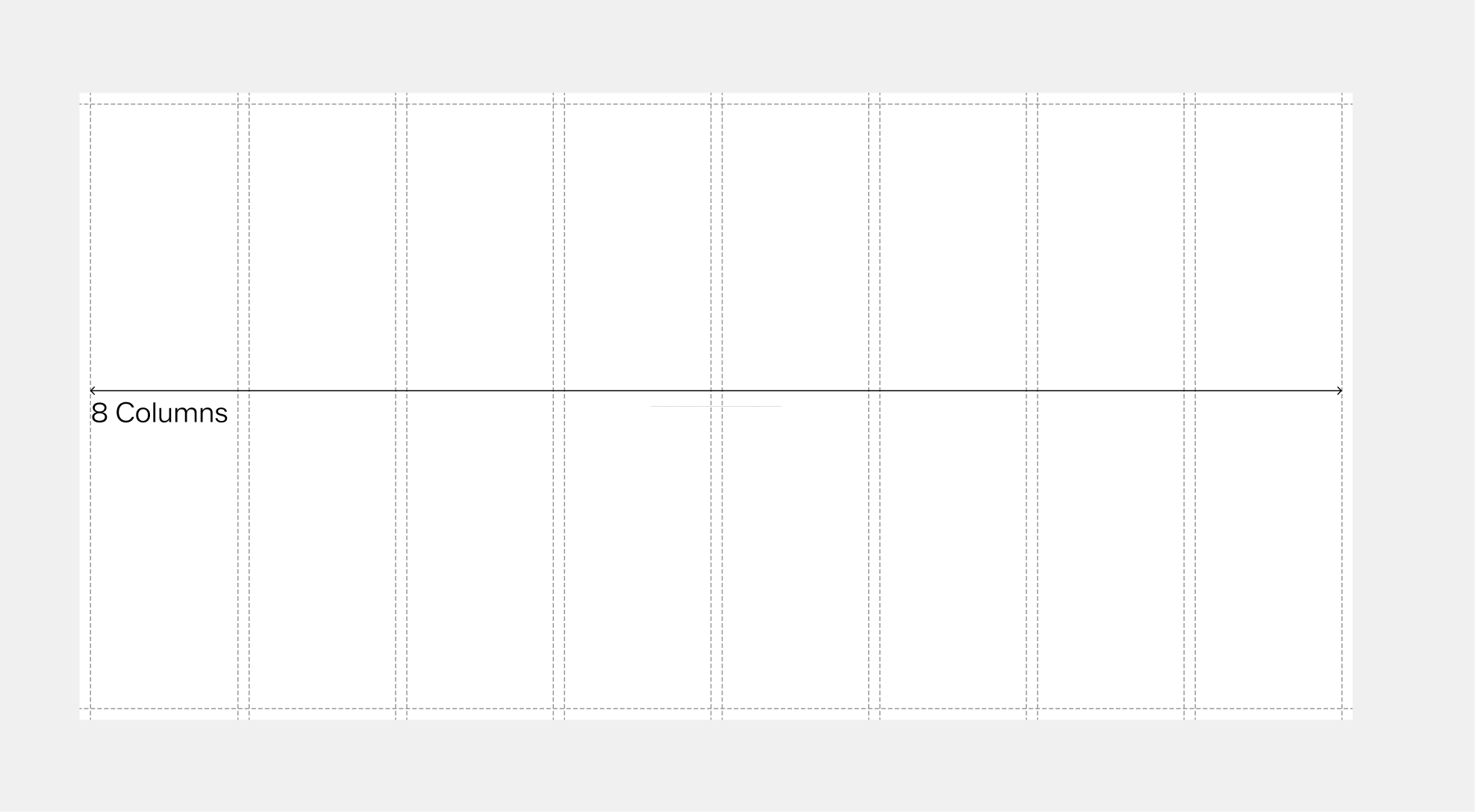
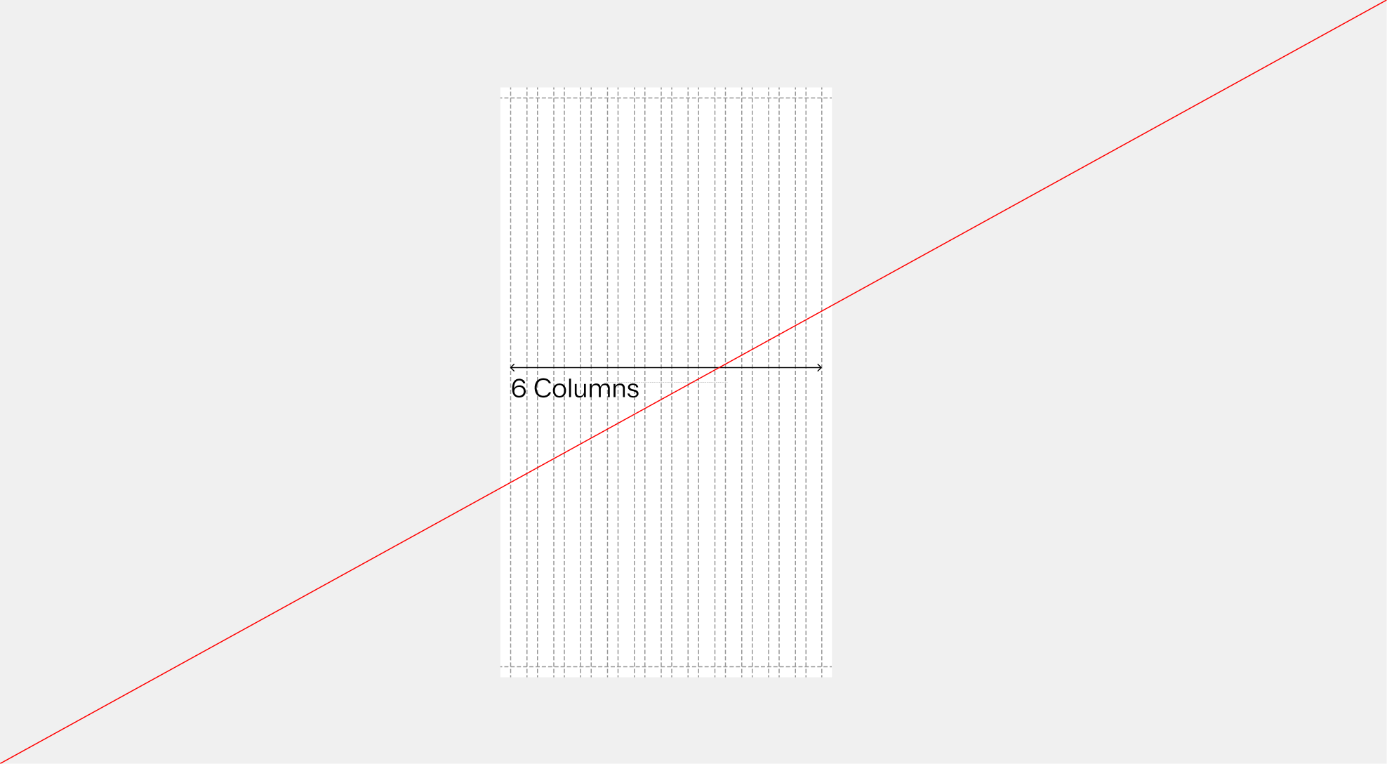
 Six-Column
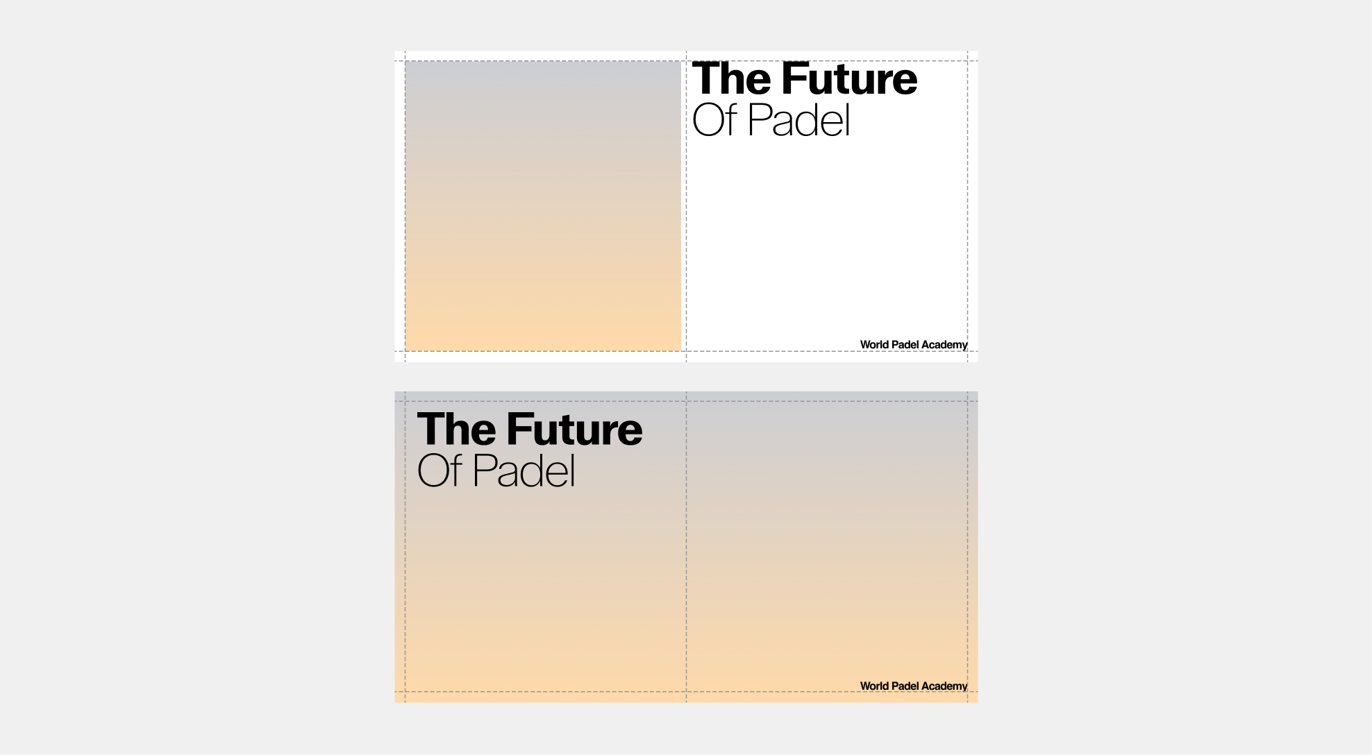
Scaling & Responsiveness
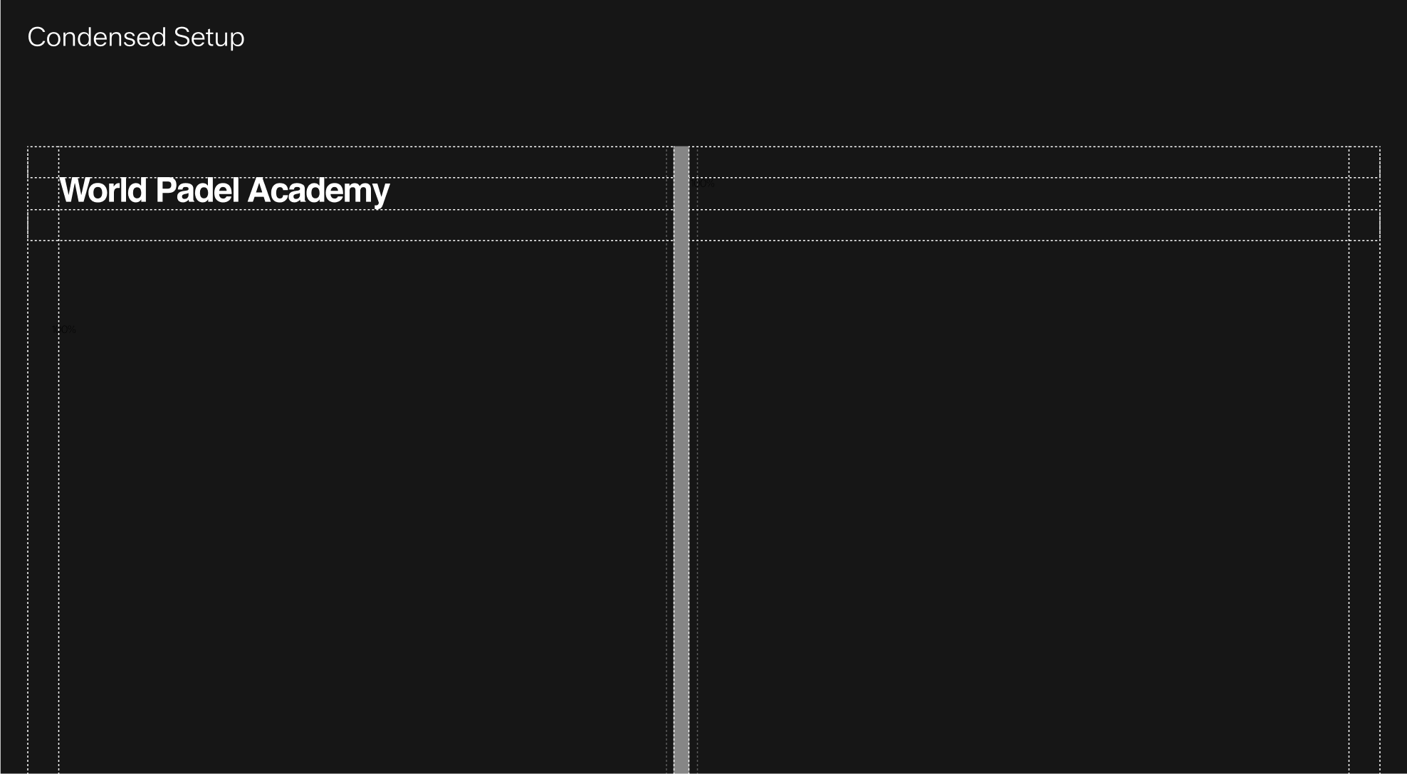
The base grid, columns, and gutters scale proportionally with the format. On smaller layouts, the structure tightens to optimize space, while on larger formats, spacing expands to provide rhythm and breathing room.
 Wide format
 Condensed format
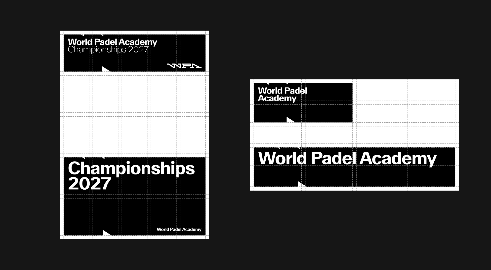
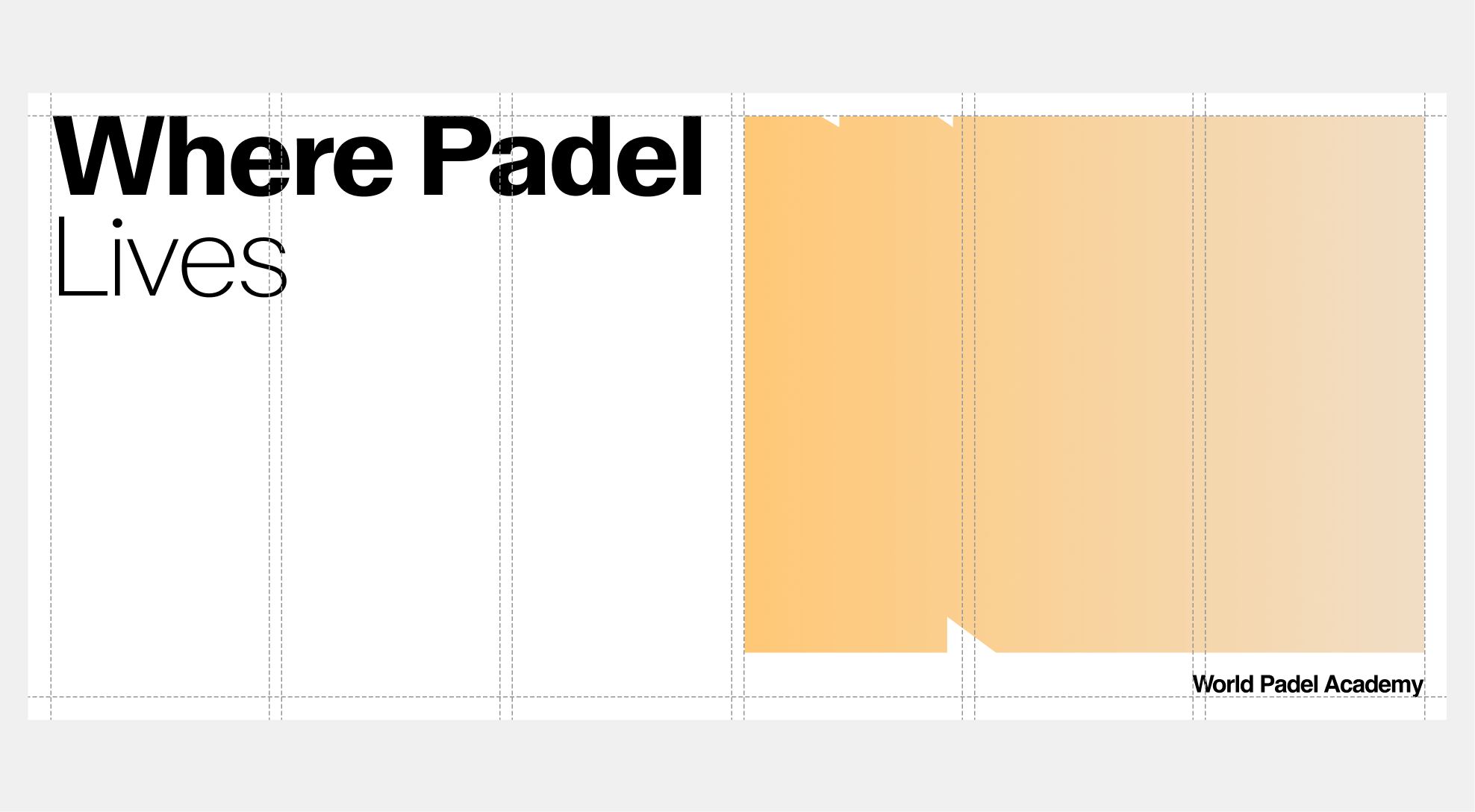
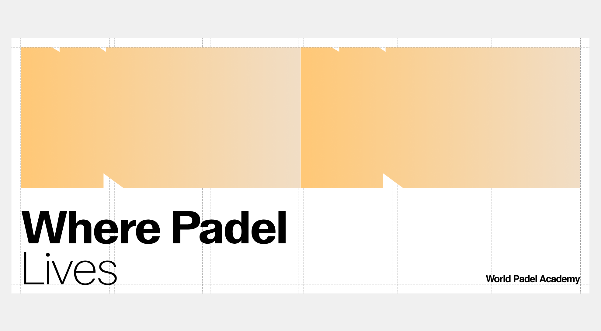
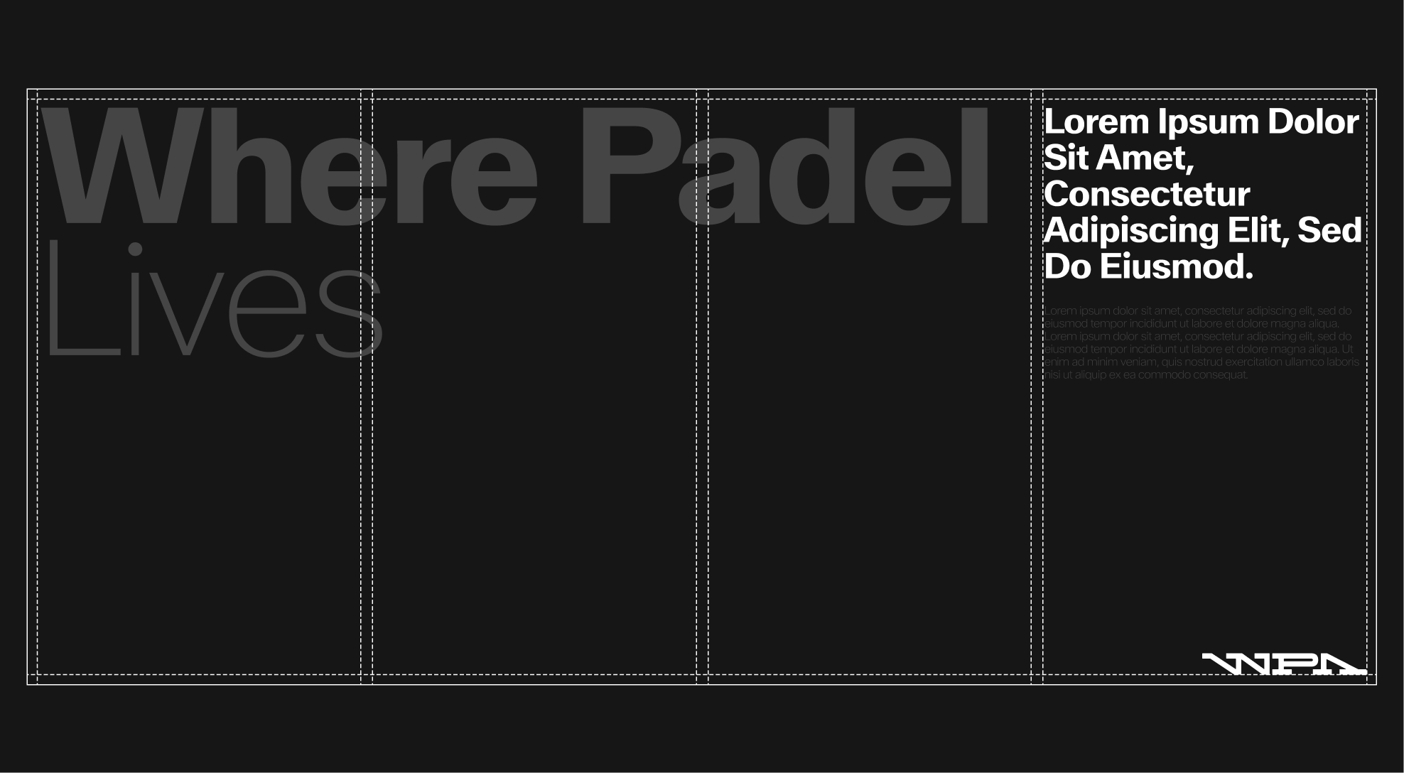
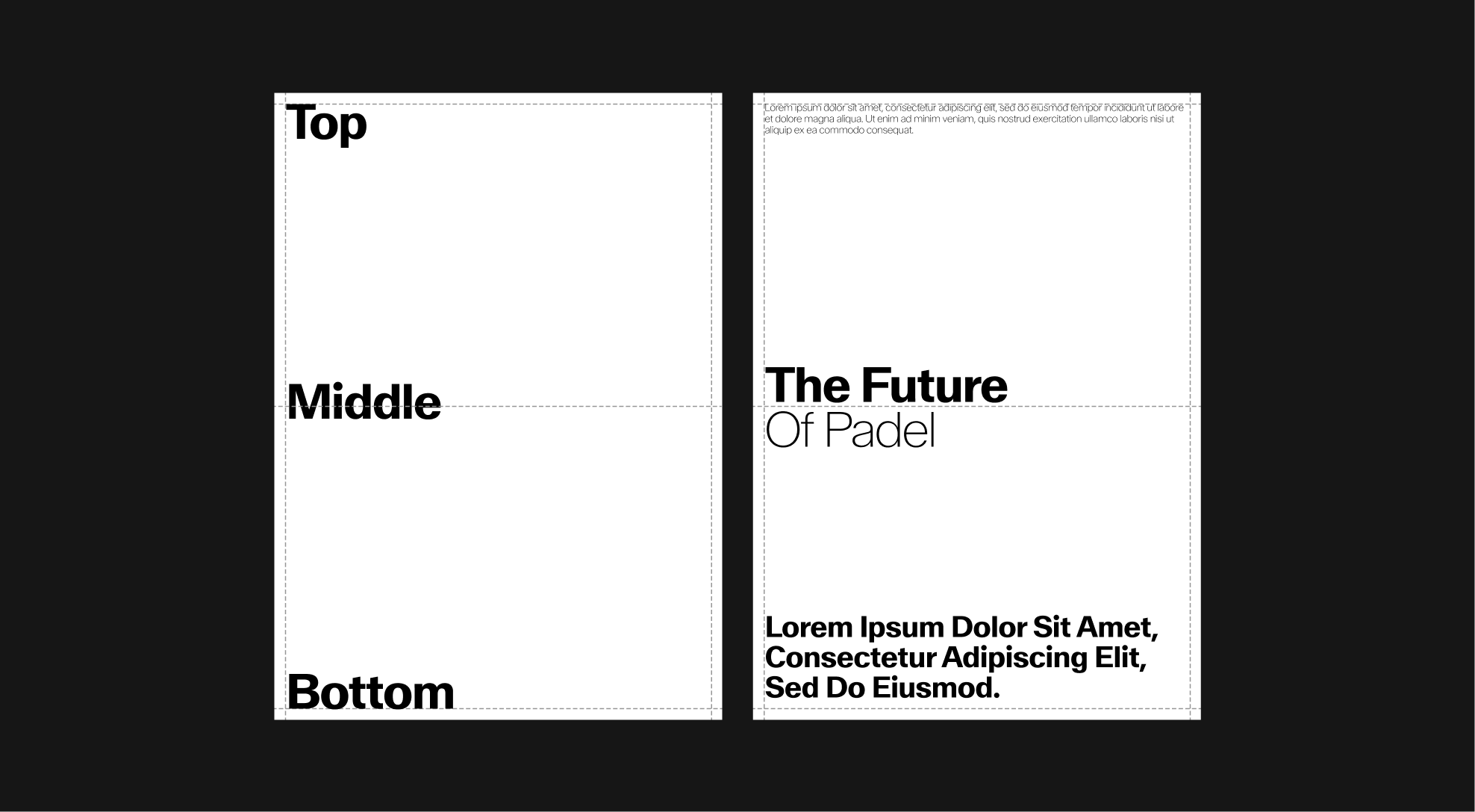
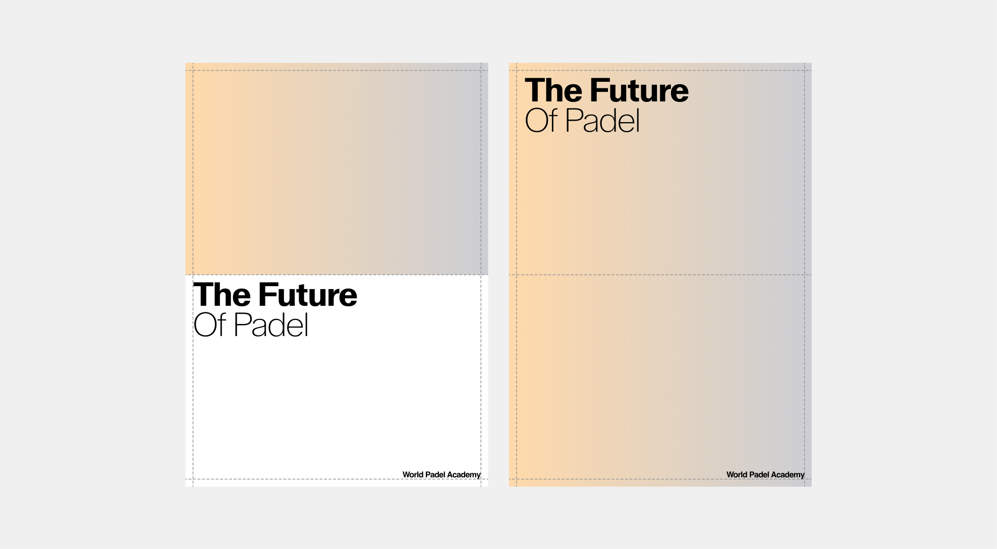
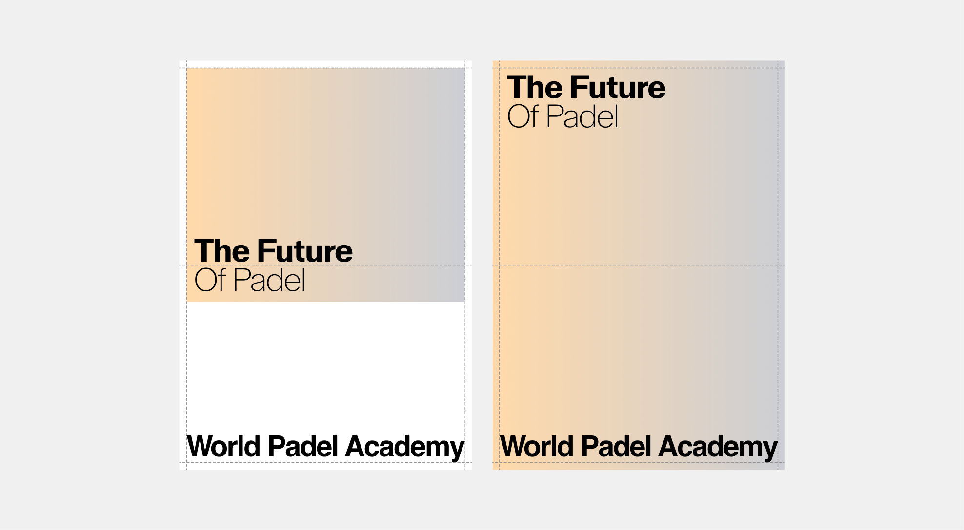
6.3. Layout Grid
Columns, Margins & Gutters
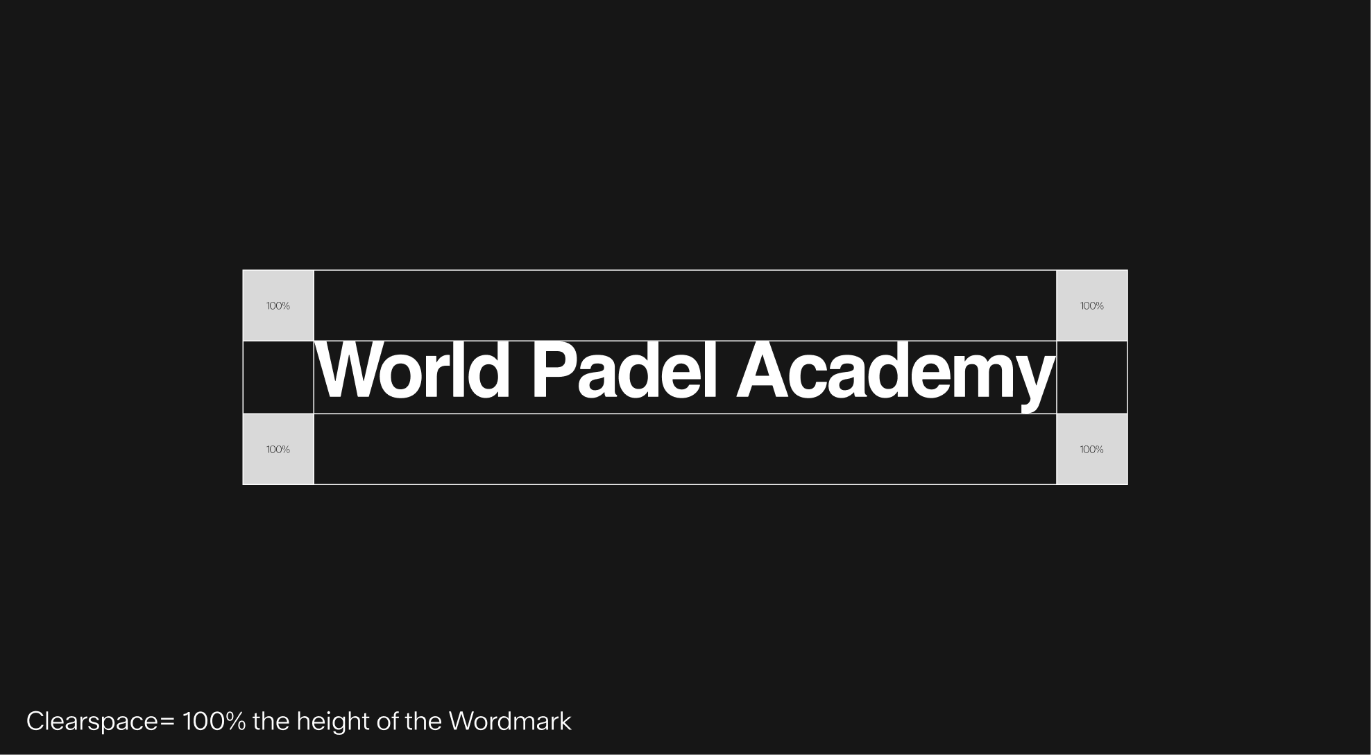
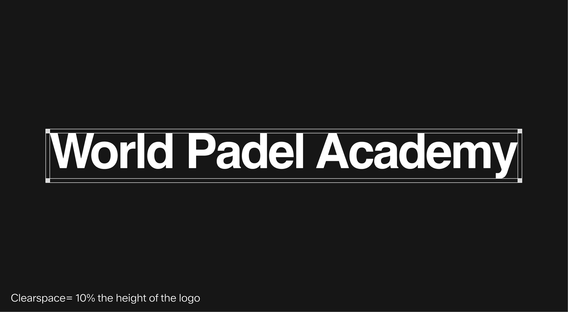
All margins, columns, and the grid are defined in relation to the logo's clear space, itself based on the height of the wordmark.
When the wordmark is smaller, the grid and margins scale directly with the clear space, ensuring balance and structure. In this case, margins typically equal 100% of the logo's clear space.
When the logo is larger, or when it spans the full width of the format, the margins and clear space are reduced progressively. On the largest formats, they can decrease to 10% of the clear space, but never below this threshold.
This flexible system ensures cohesion across applications, allowing layouts to remain consistent, proportional, and visually clear regardless of format.

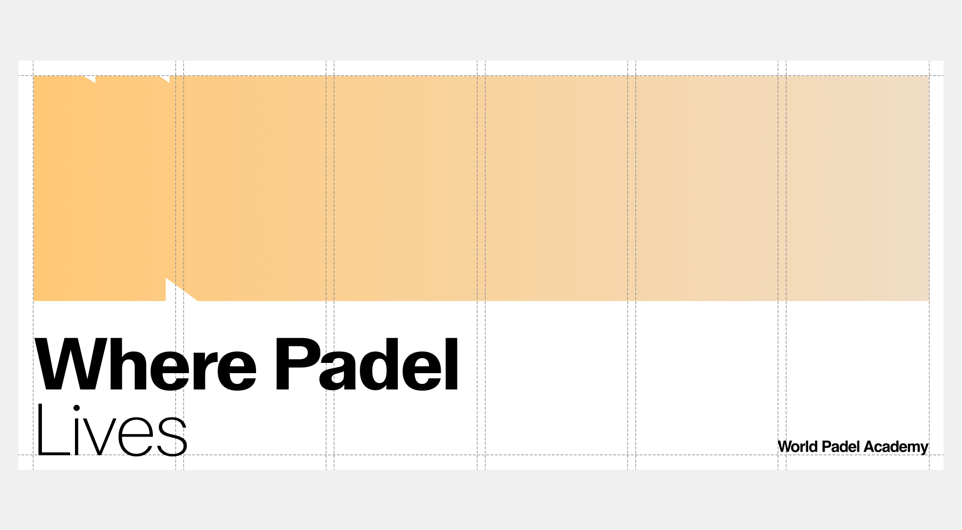
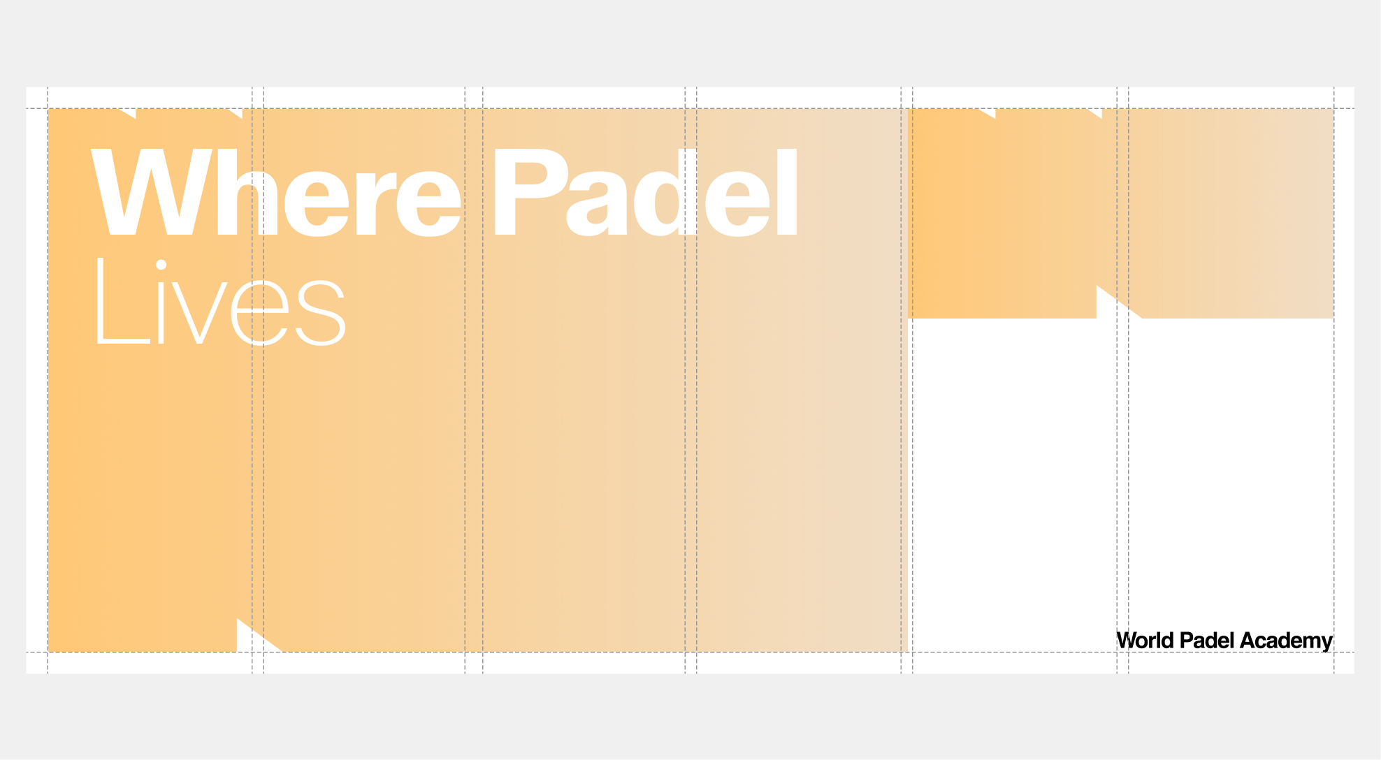
System
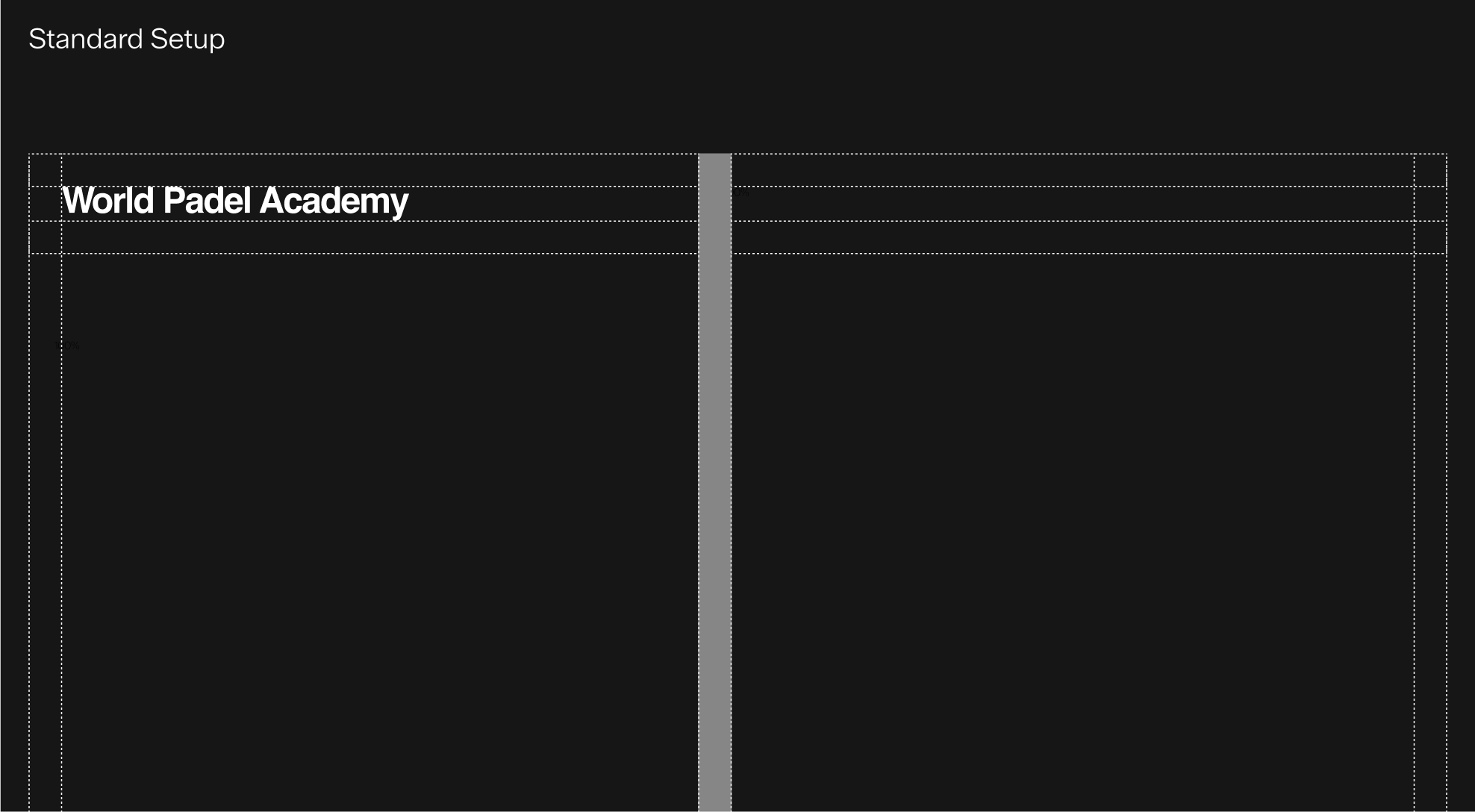
Columns, Margins & Gutters
Margins, columns, and gutters are directly based on the height of the wordmark. Columns are distributed across the full width of the format, while gutters and margins remain evenly spaced. All margins are defined as multiples of 10px and are directly linked to the logo's clear space:-With smaller logos, margins equal 100% of the clear space to ensure visibility and balance.
-With larger logos, margins can be reduced to 10% of the clear space, keeping layouts compact yet consistent. This system ensures that margins always adapt fluidly to the logo size, maintaining proportionality, clarity, and consistency across all applications.
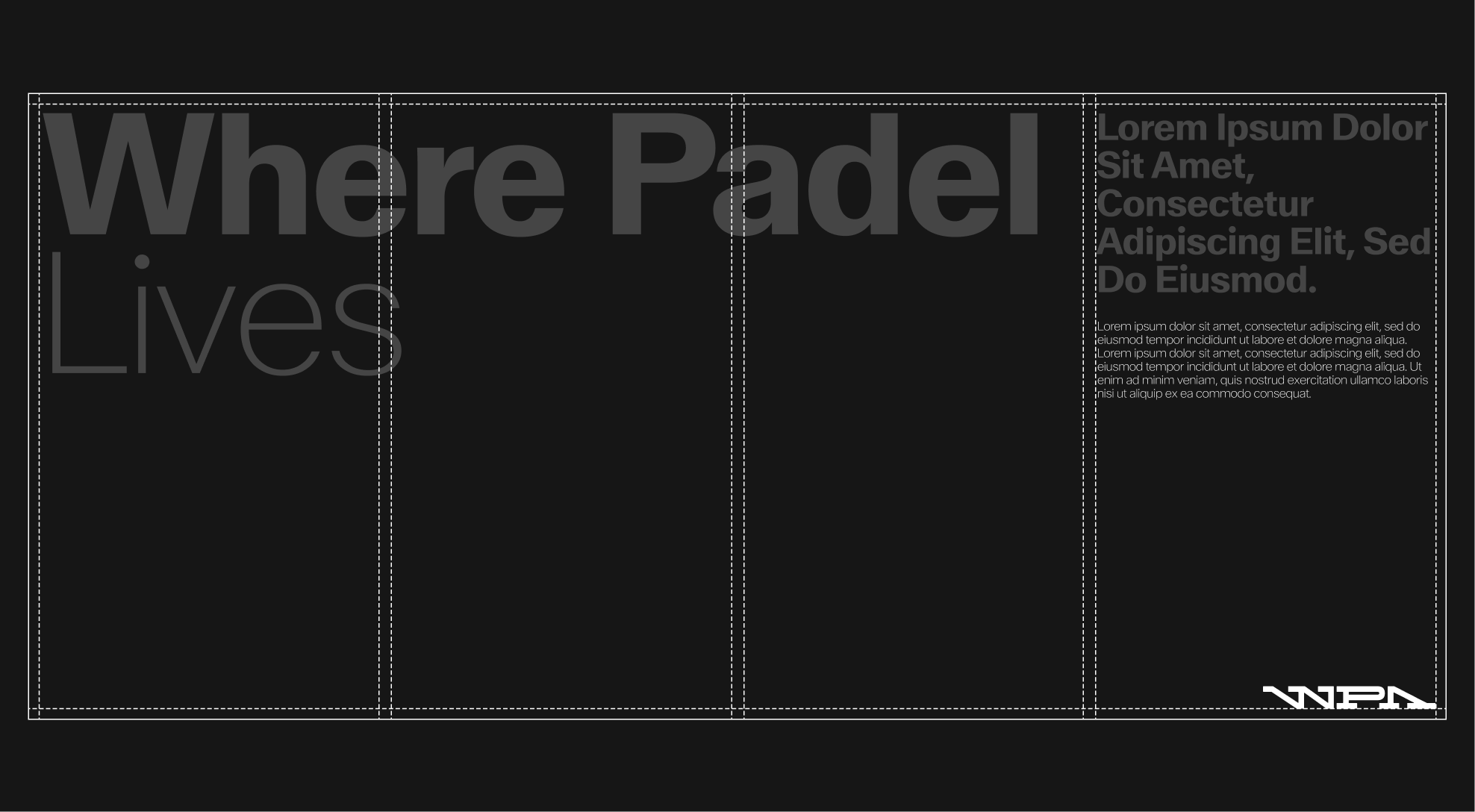
System
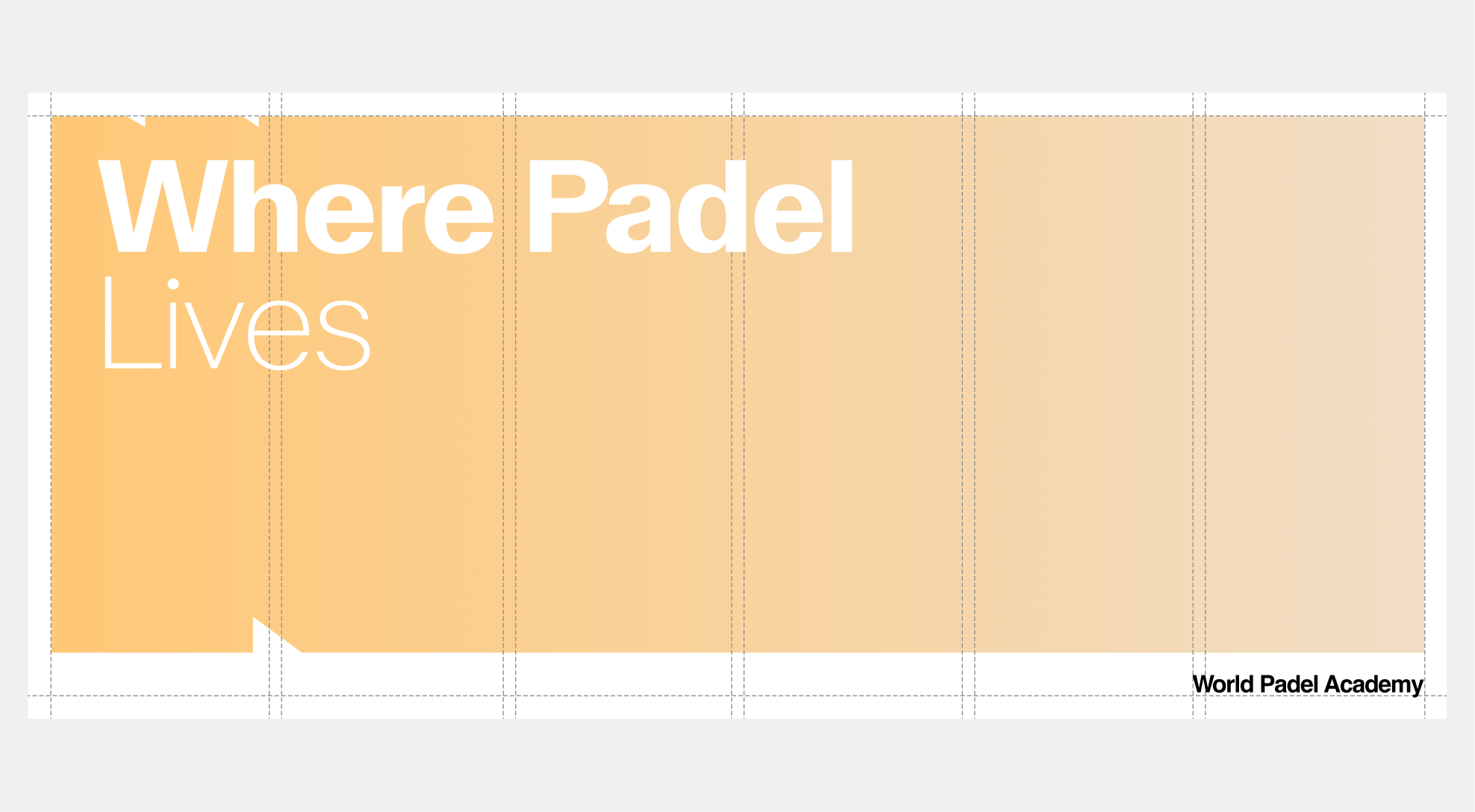
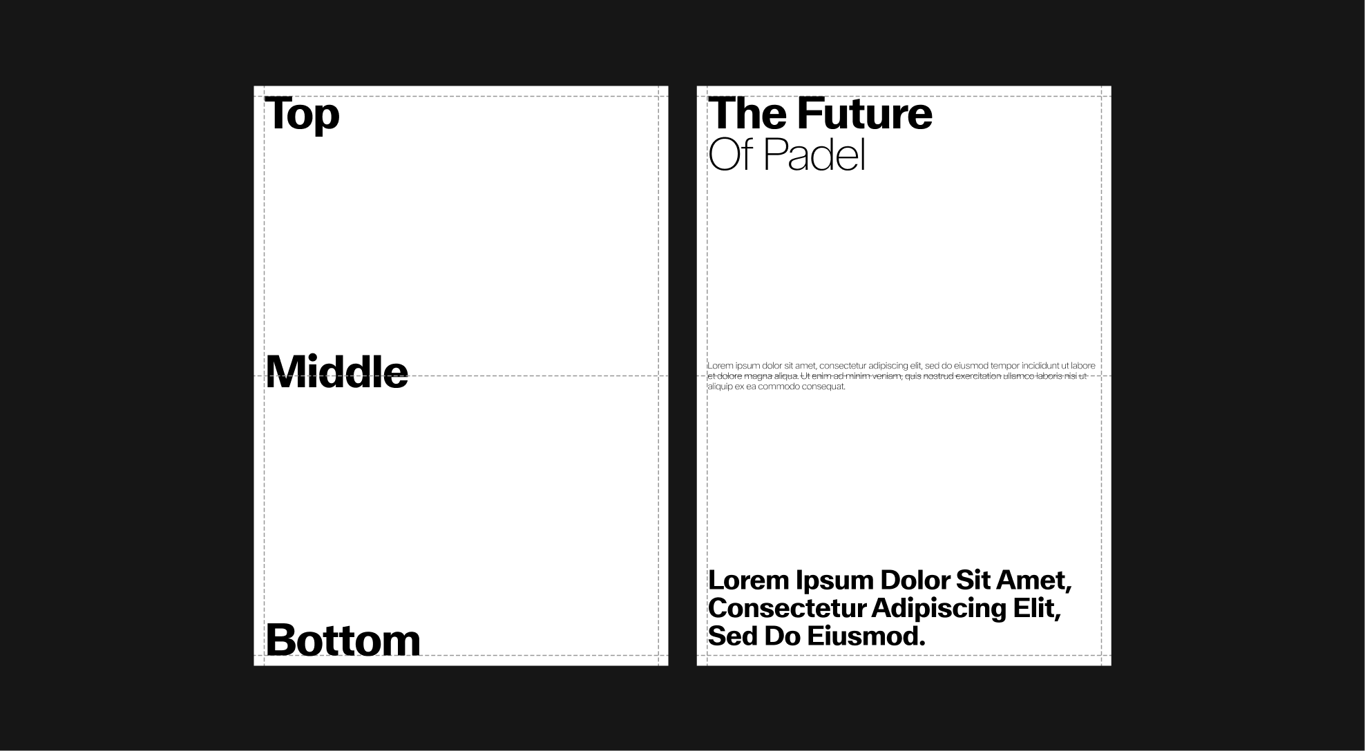
Gutters
In most cases, the gutter is set to 100% of the margin, which equals 100% of the logo height. This ensures visual consistency and balanced spacing between columns.
In certain specific formats, however, the gutter may be reduced to 50% of the margin and logo height. This adjustment helps optimize the available space, especially on narrower layouts, while maintaining readability and overall system consistency.
 Six Column
 Six Column
 Six Column
 Six Column
 Six Column
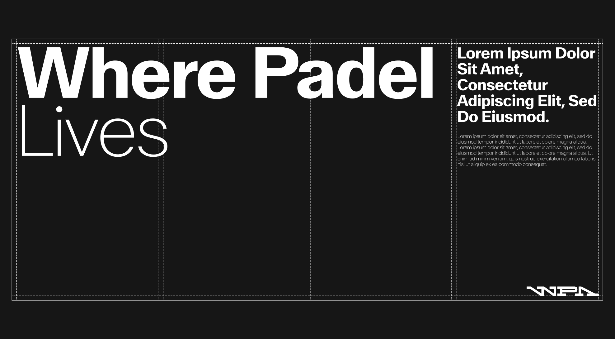
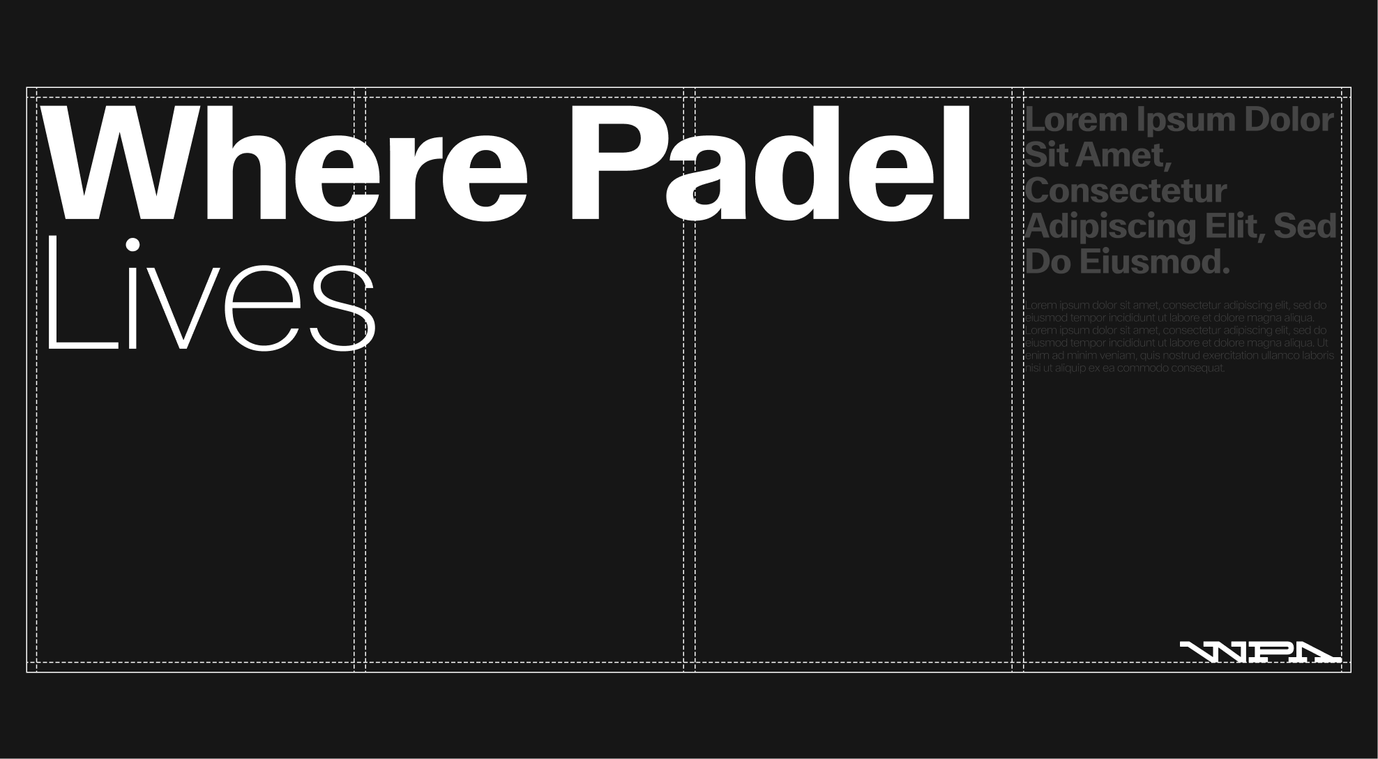
Sizing & Proportions
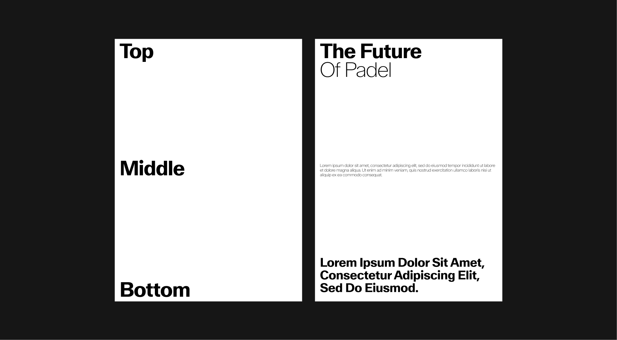
Use no more than three type sizes within a layout. Ensure a strong distinction between headings and body text, with titles always carrying greater visual weight to create contrast and dynamism.

Format Adaptations
Typography hierarchy must remain consistent across all formats. -Main titles scale proportionally with the formats width to preserve maximum impact. -Subtitles and body text adjust progressively, always maintaining sufficient contrast with titles and aligning with margins and columns. -On narrower formats (vertical or mobile), titles may span the entire format but must remain the most prominent element in the composition. -On wider formats (horizontal), hierarchy is reinforced through larger titles combined with a more spacious arrangement of content.
This approach ensures that layouts remain legible, dynamic, and consistent across every adaptation.
 Standard format — A4
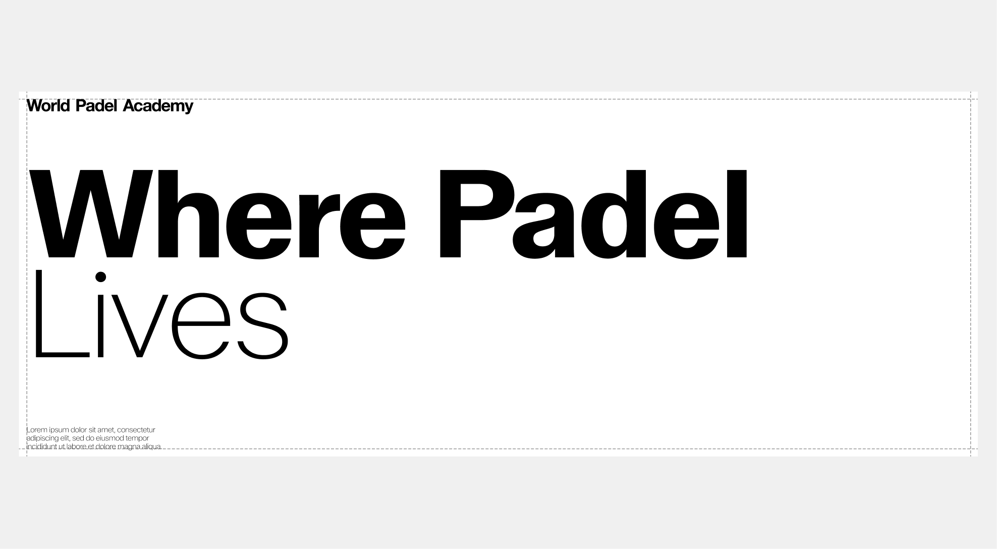 Standard format — 3/2
 Standard format — 9/16
 Standard format — 4/5
 Standard format — 3/1
 Standard format — 4/1
6.4. Visual Applications
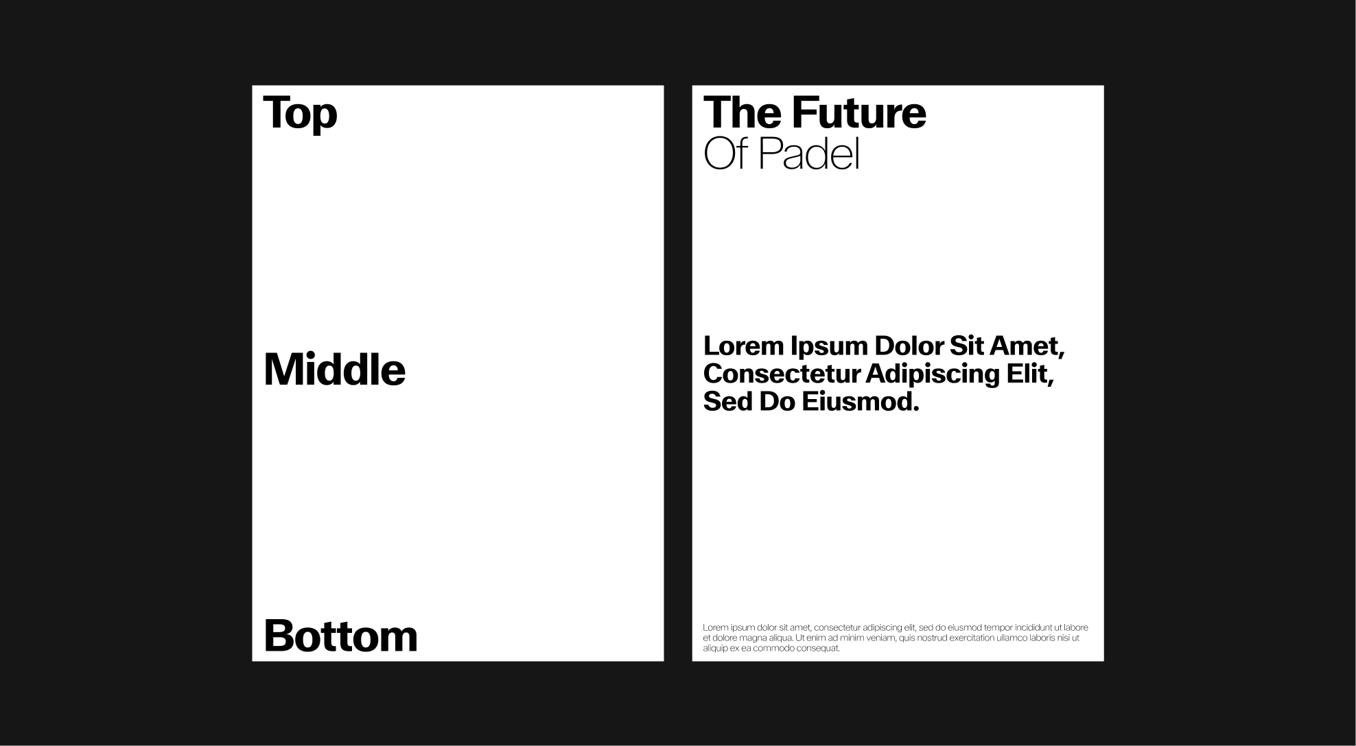
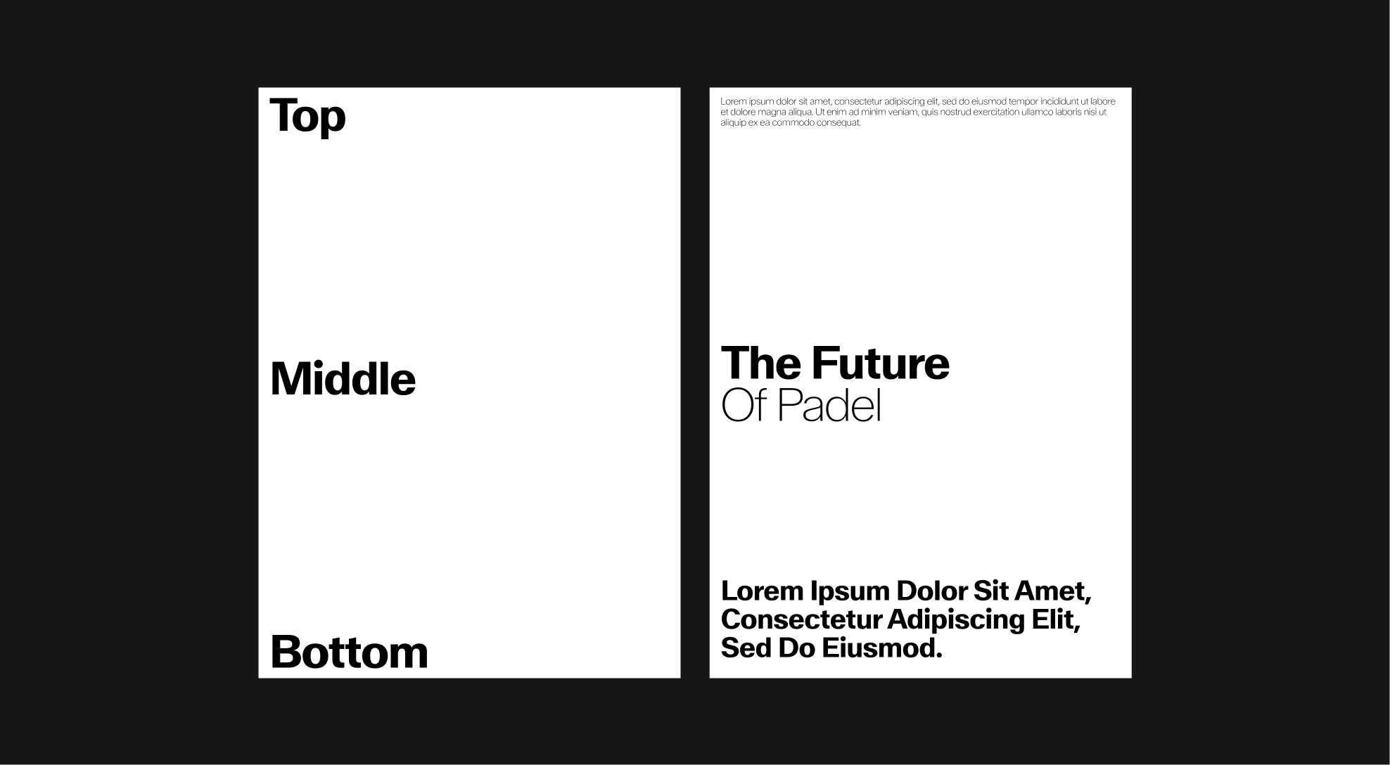
Type-led Layouts
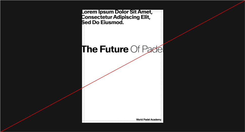
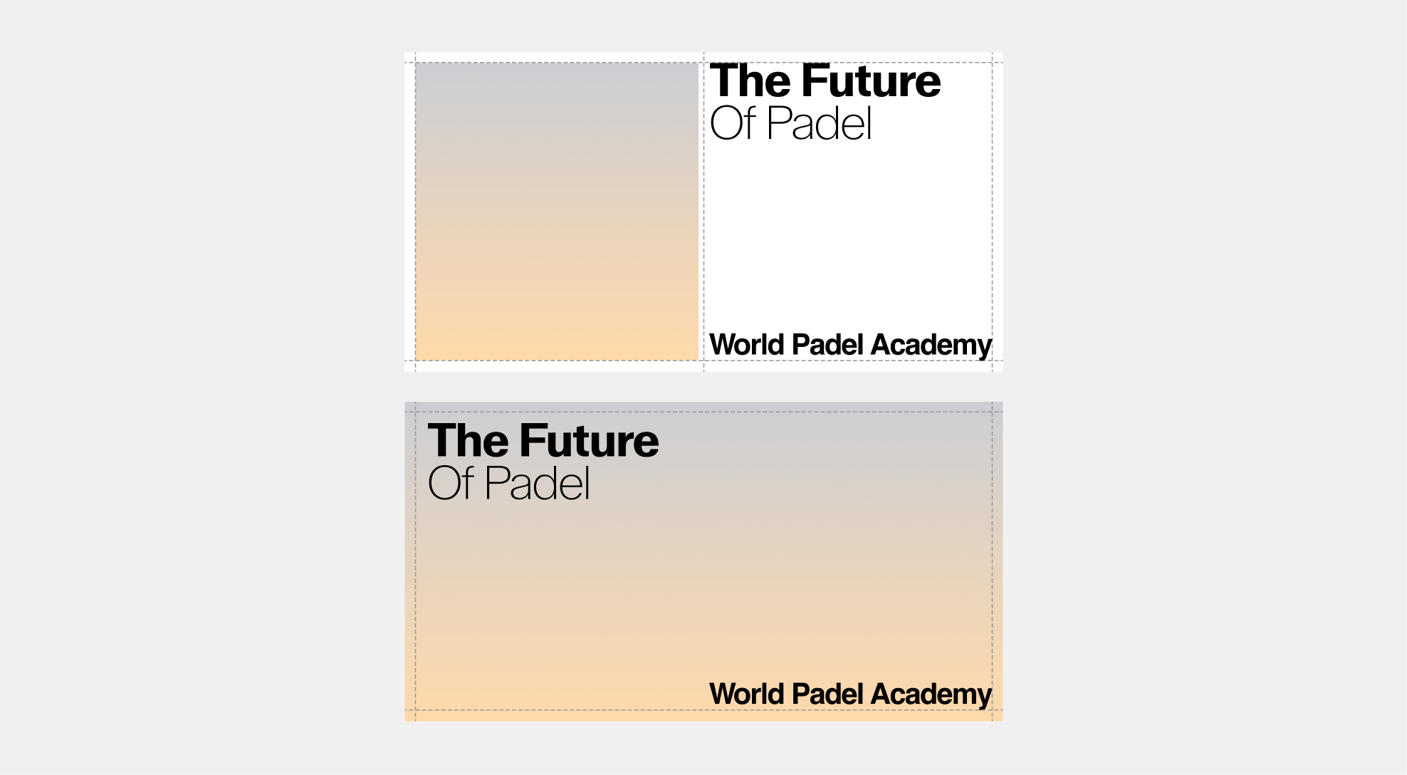
When arranging typography, clarity comes first. Keep it bold and straightforward, avoiding unnecessary complexity. Shown below are three recommended ways to position typography within a layout.

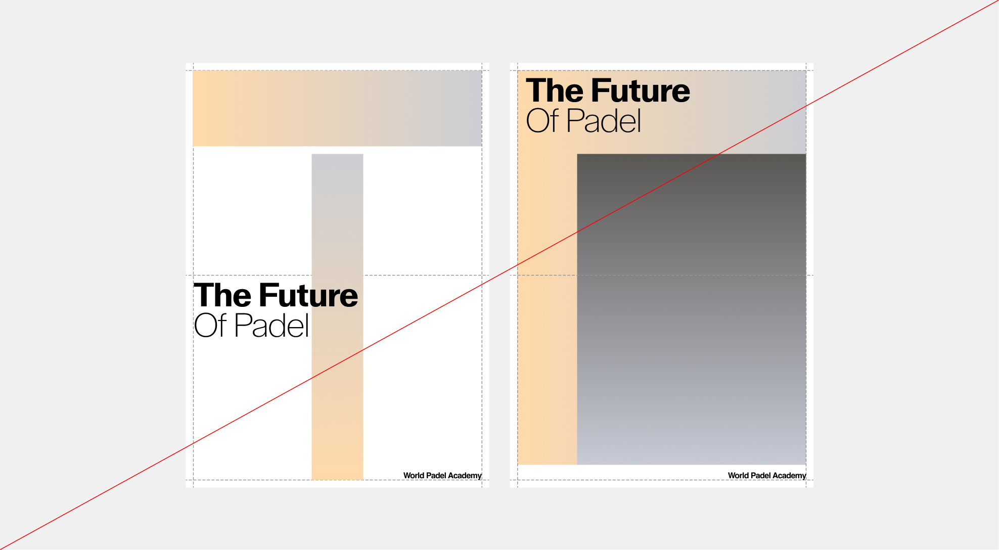
Type-led - Misuse
Ensure typography stays clean and minimal. The following show what not to do.
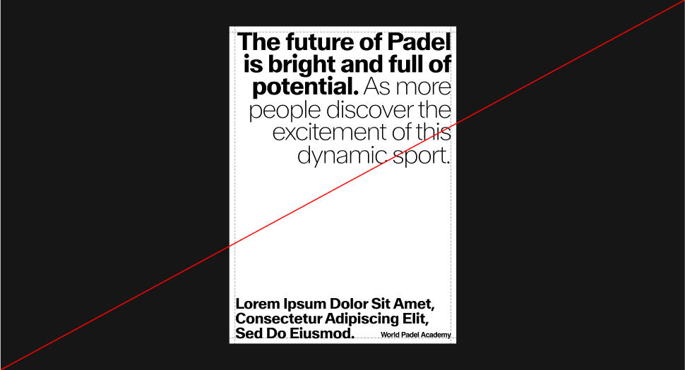 Do not left-align headlines.
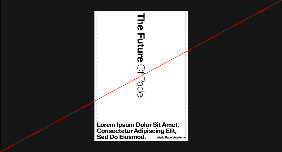 Do not rotate headlines or alter the layout rules
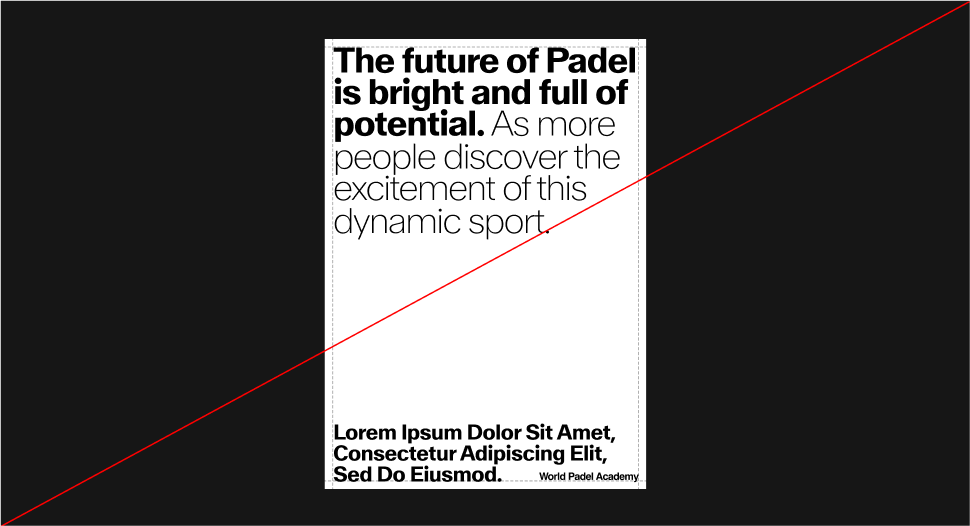 Headlines should not be too long.
 Do not exceed the margins.
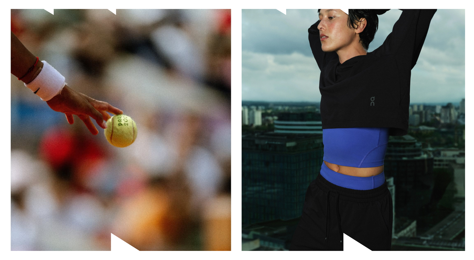
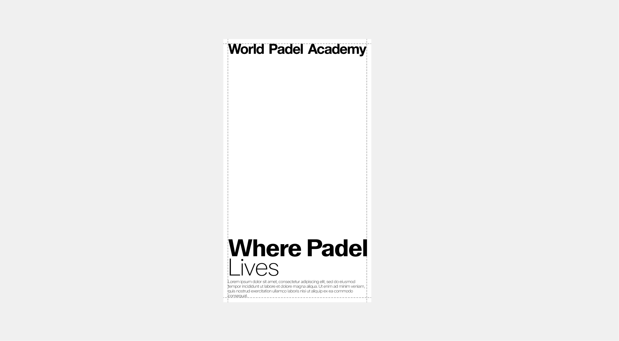
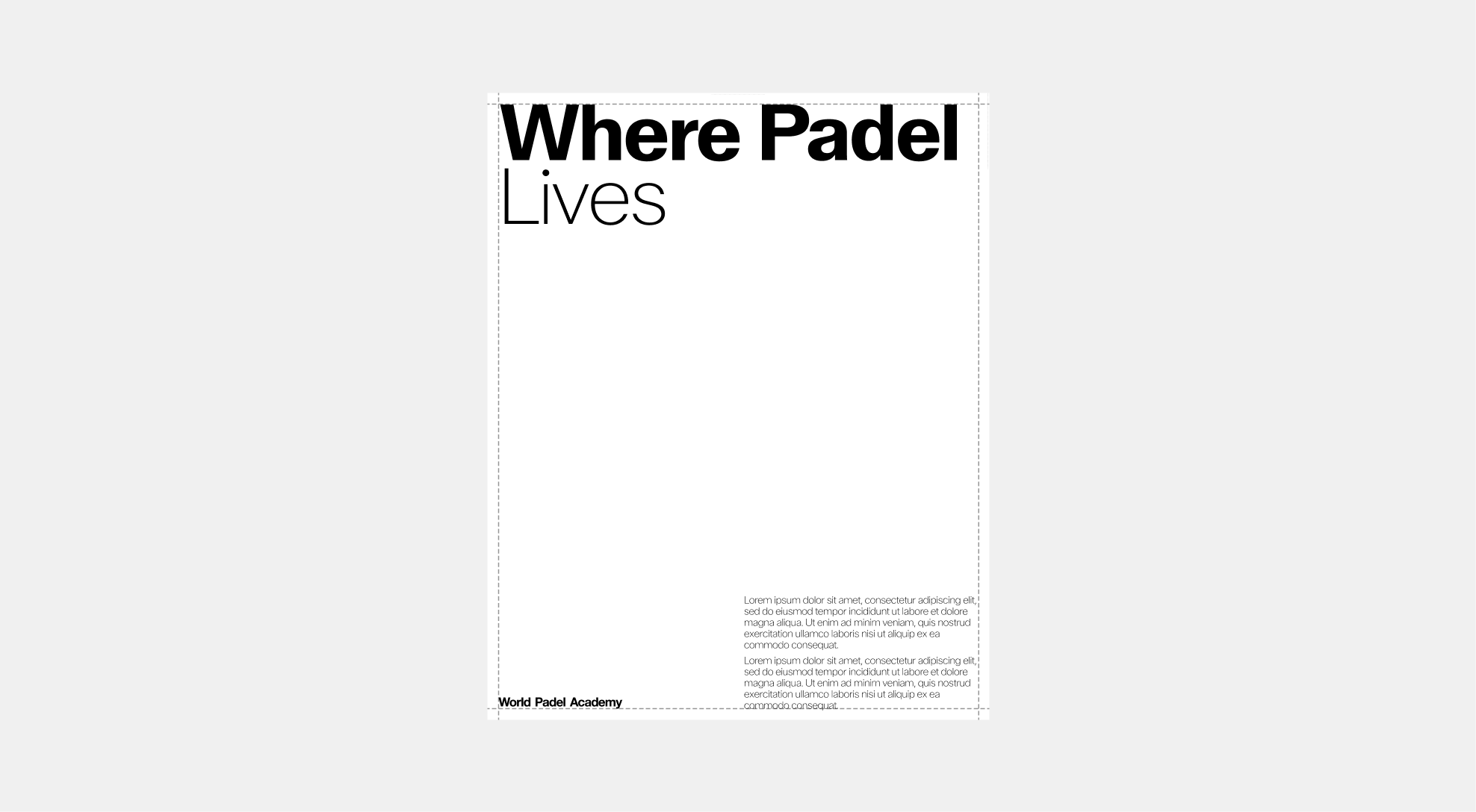
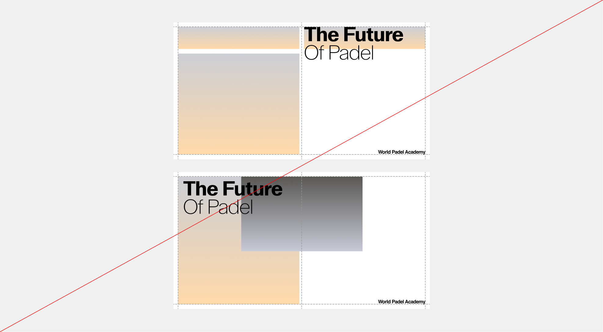
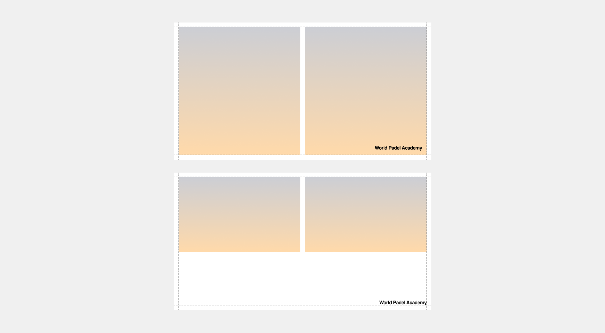
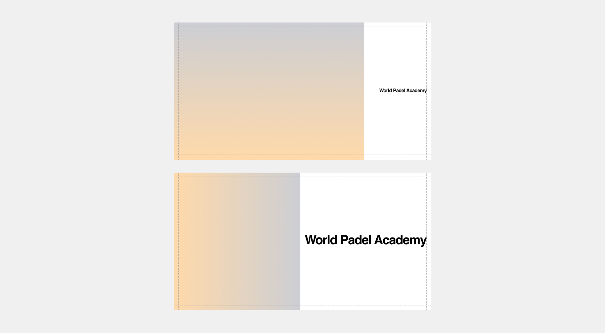
Single Image Layouts
When building layouts, always use a single image ratio per format. This allows the image to occupy maximum space and retain its visual impact. Keep typography simple and aligned to the margins, ensuring that spacing between text and imagery respects either the logo’s clear space or the established grid.
 Example 01 - Vertical
 Example 02 - Vertical
 Example 01 - Horizontal
 Example 01 - Horizontal
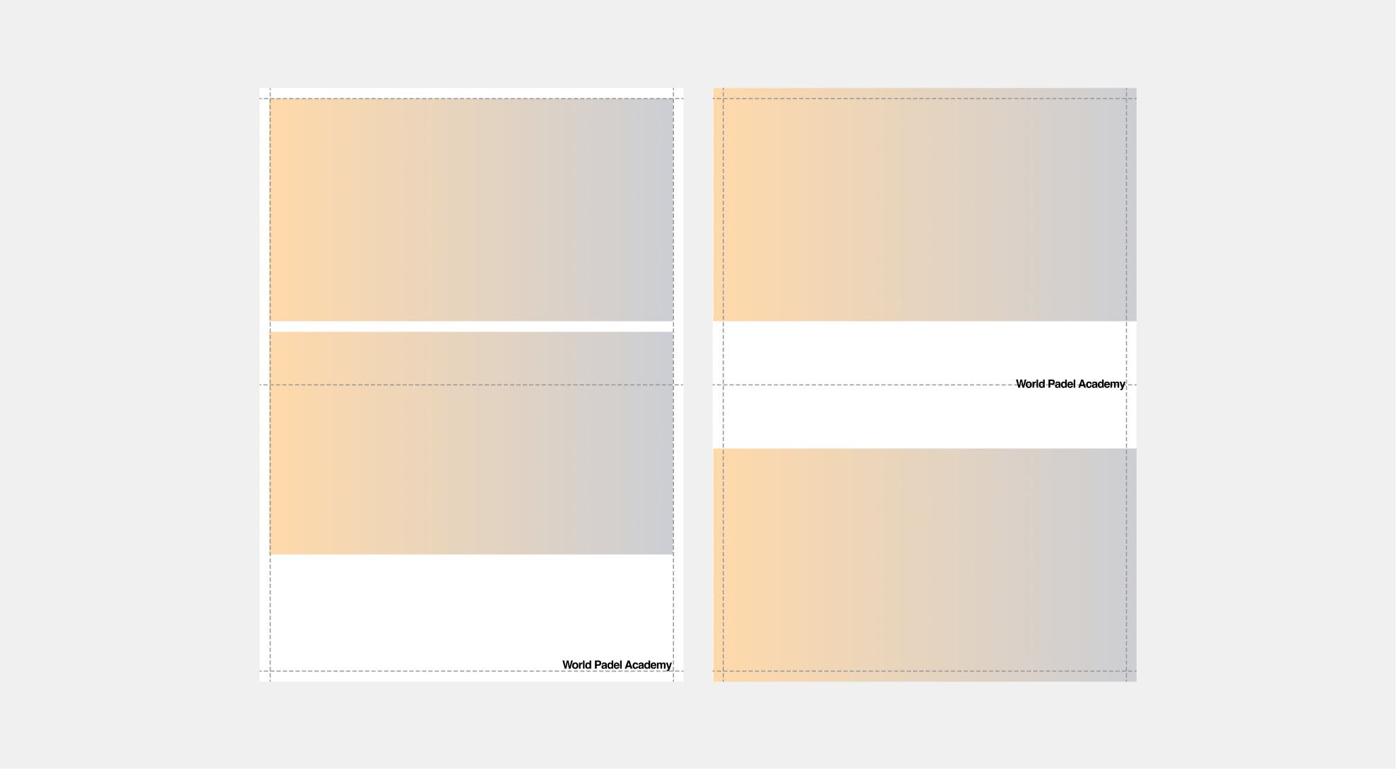
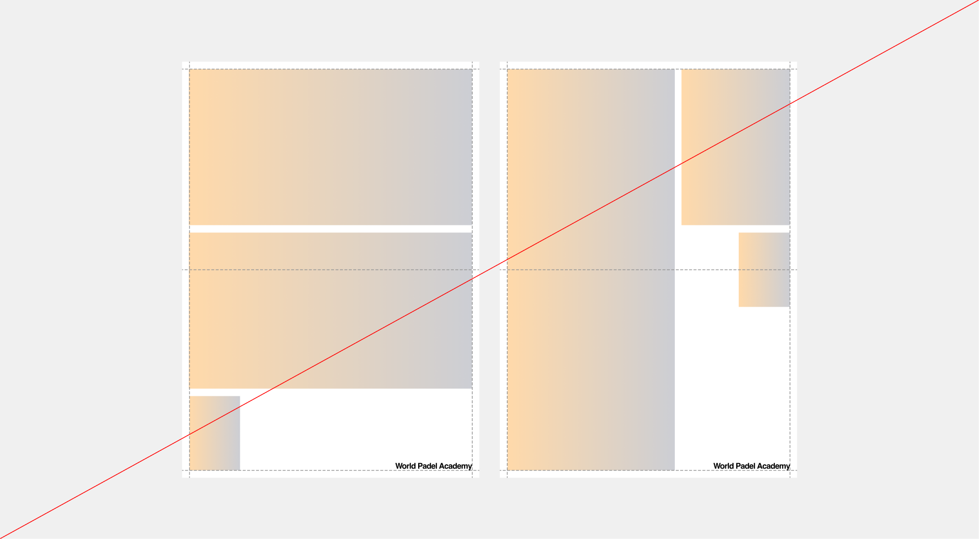
Single Image - Don't
Never apply multiple image ratios within the same format, and avoid stacking or overlapping images. Keeping the system clean and straightforward ensures an elevated, confident, and leadership-driven visual identity.
 Example 01 - Vertical
 Example 02 - Vertical
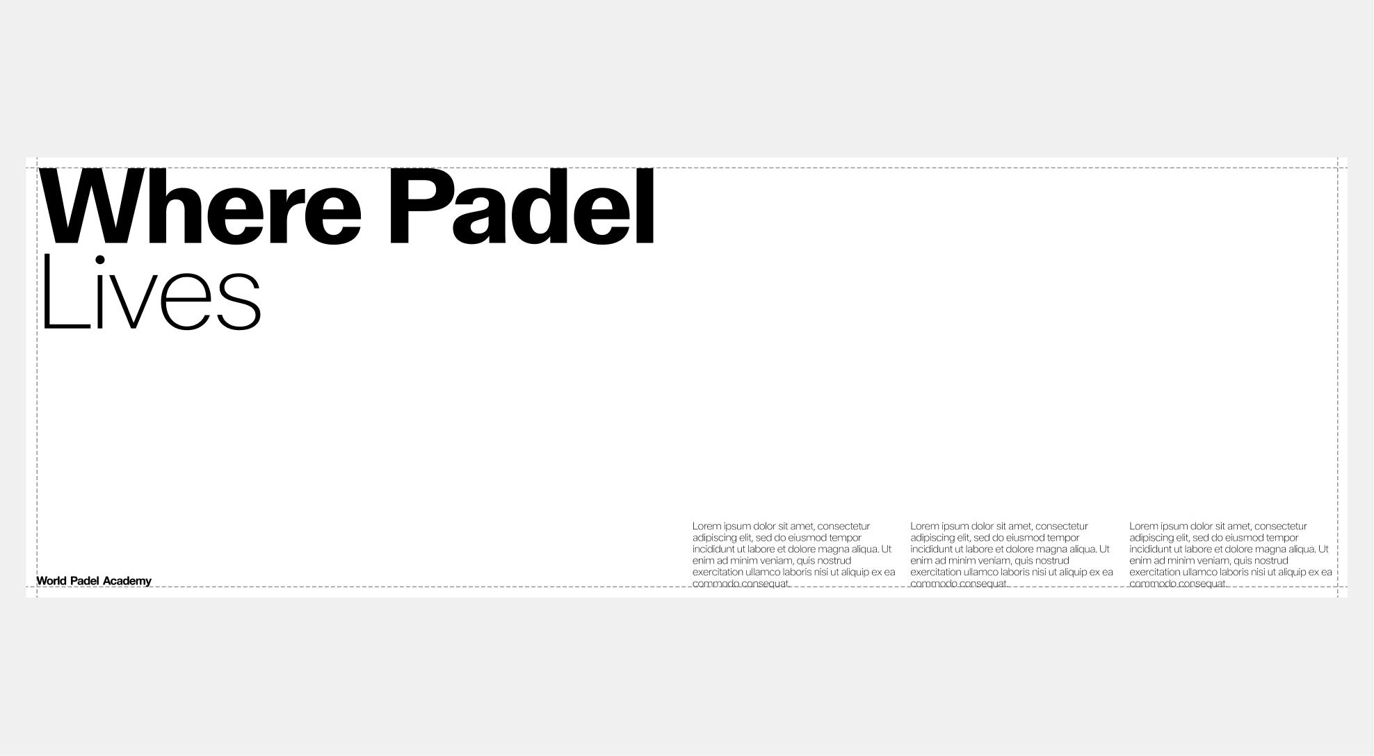
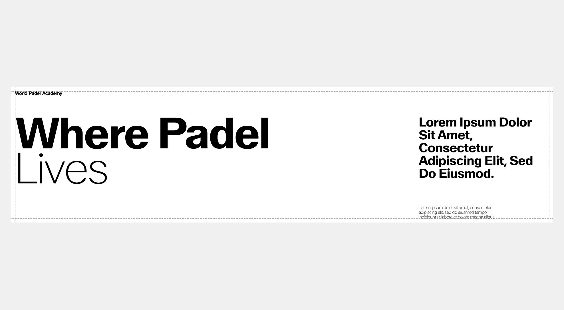
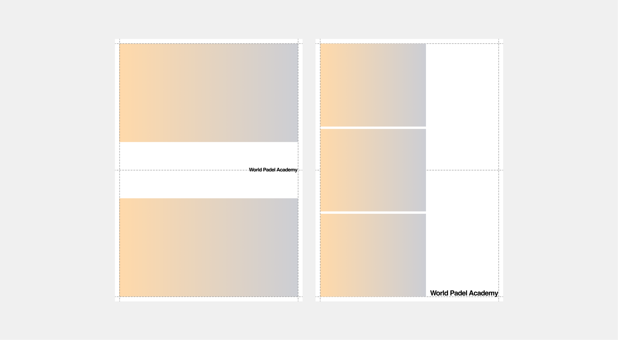
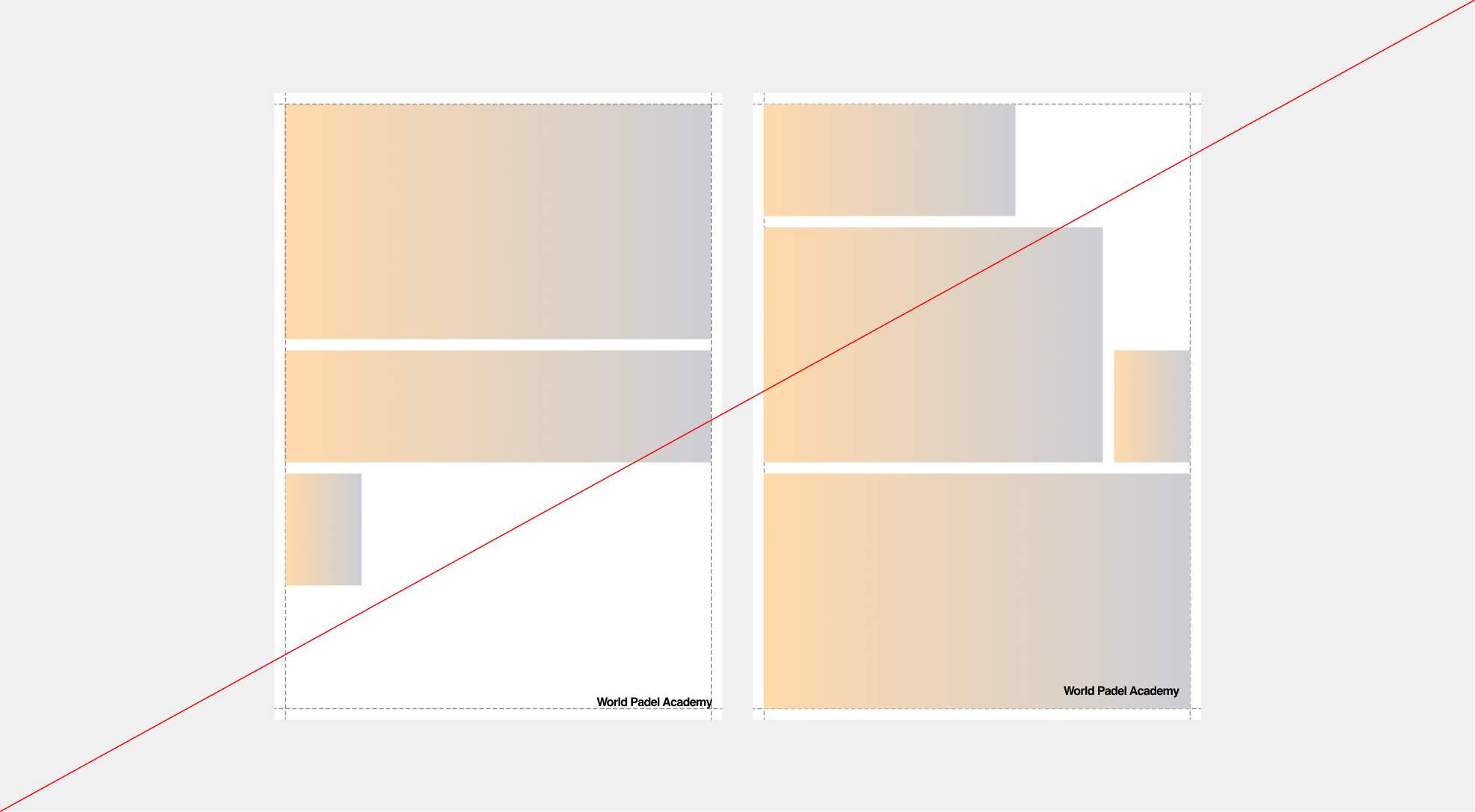
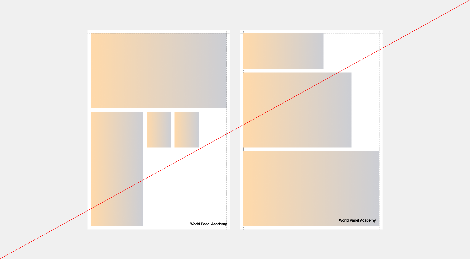
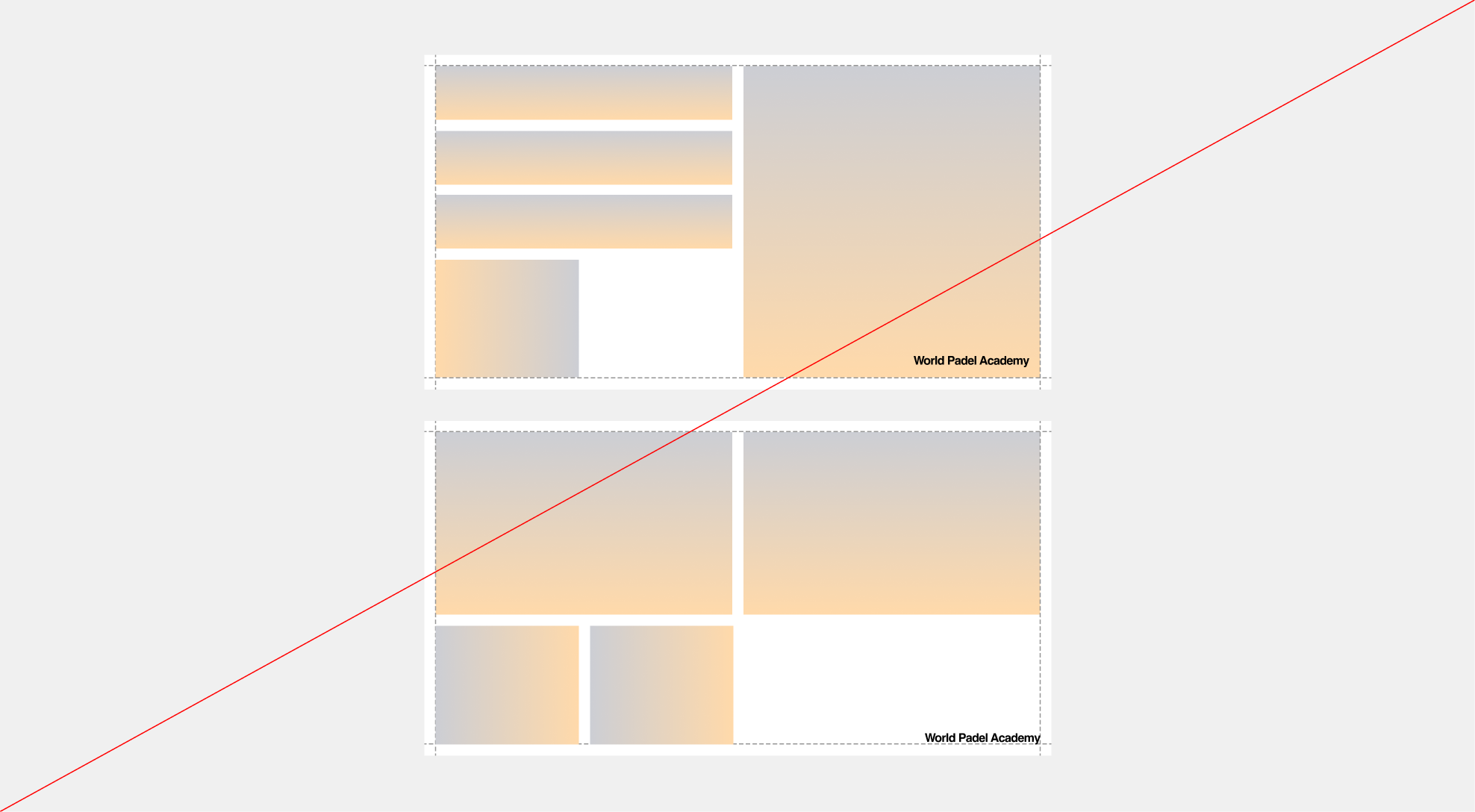
Multiple Image Layouts
Use multiple images only in specific cases, such as editorial or print formats, where the layout naturally allows for more complex compositions. Even in these situations, images must follow a consistent ratio and remain aligned within the grid to preserve clarity and balance.
 Example 01 - Vertical
 Example 02 - Vertical
 Example 01 - Horizontal
 Example 02 - Horizontal
 Example 01 - Vertical
 Example 02 - Vertical
 Example 03 - Vertical
 Example 01 - Horizontal
Example 02 - Horizontal
Example 01 - Horizontal
Example 02 - Horizontal
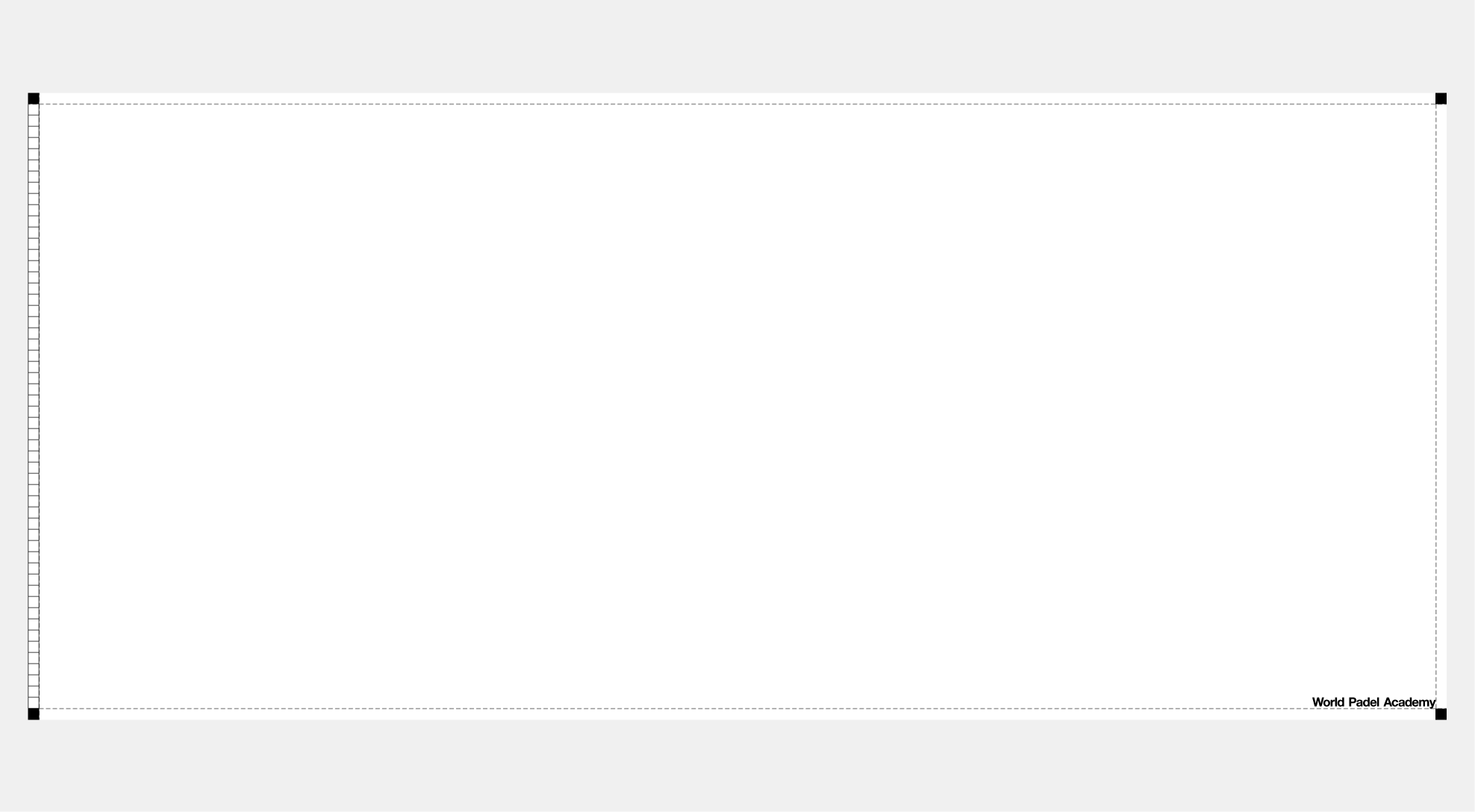
The Box Module
This graphic module is designed as a flexible container within our base grid. It can adapt to any length or height, allowing it to frame content, host images, or structure text. By combining static and scalable parts, the box serves as a versatile tool to organize and hierarchize information while maintaining consistency across applications.
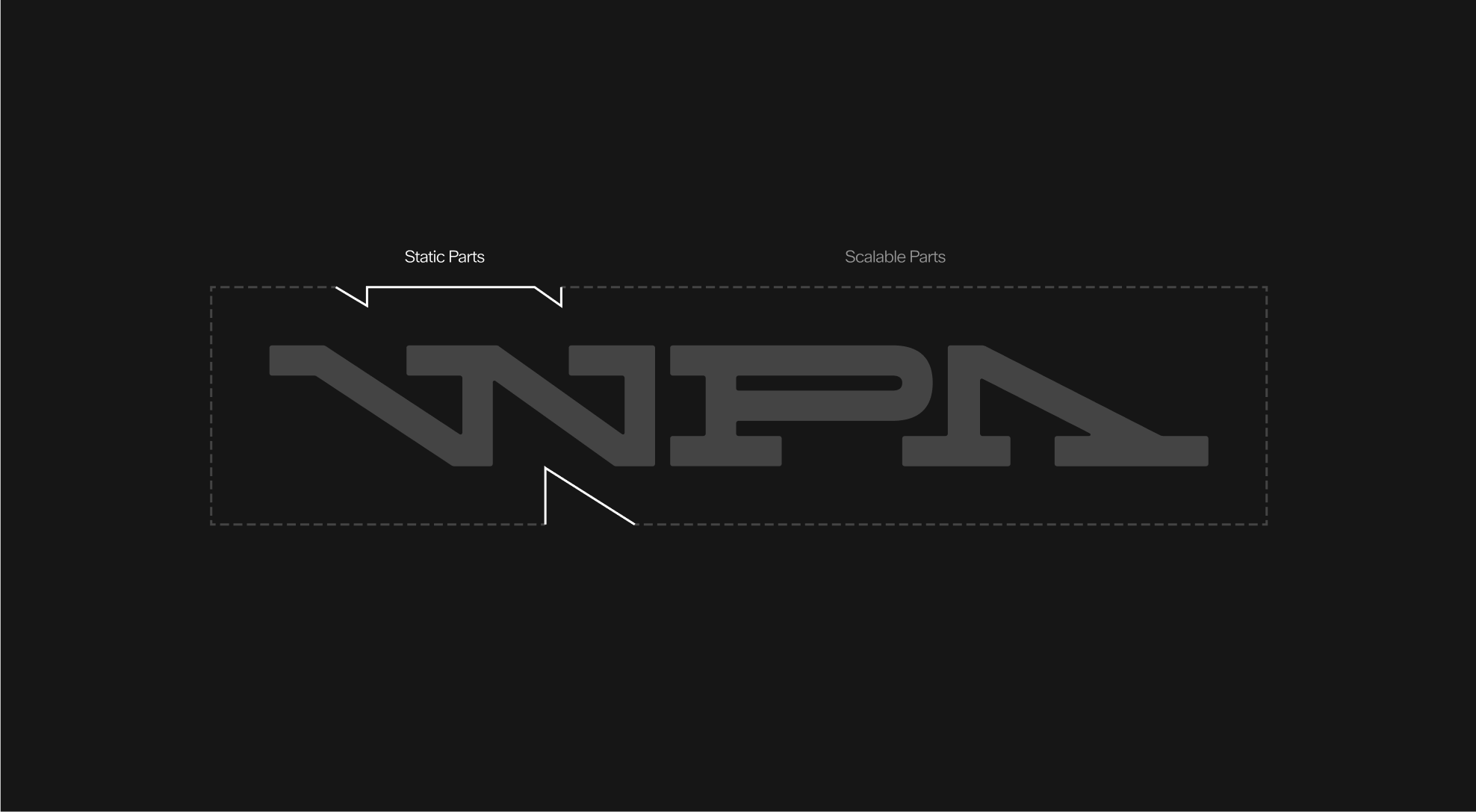
Container box
Usage
All elements of the WPA Academy system are consistently aligned to the grid, ensuring structure and visual coherence across all formats. The modules are highly flexible and can also serve as containers, not only to organize text and hierarchy but also to host images. This adaptability makes them a central tool for building dynamic and consistent layouts. For more details, refer to Part 5: Graphic Devices / Container Devices.